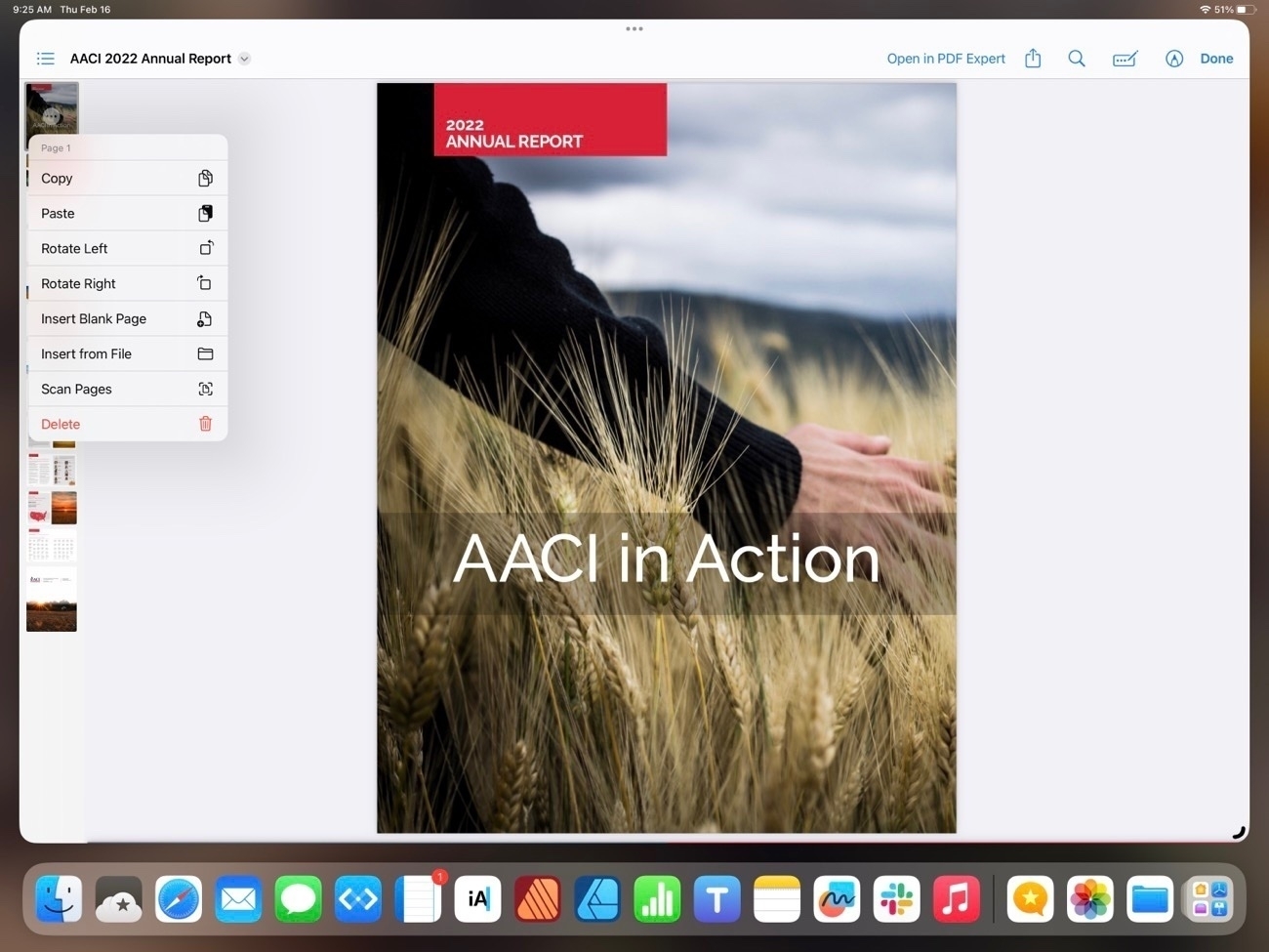
iPad Journal
- That FCP does not allow editing off of an external SSD is true but it's a limitation of FCP. LumaFusion and DaVinci Resolve both have this feature
- The lack of some keyboard shortcuts in FCP has nothing to do with iPadOS
- The interaction of FCP with Stage Manager is critiqued but again, this is how Apple has implemented FCP. I've not used DaVinci Resolve but LumaFusion has no problem with Stage Manager on the iPad screen or full screen on an external screen. It's excellent.
- Round-tripping a FCP project from iPad to Mac and back. Again, this is likely a limitation of FCP not iPadOS.
- A general collection point for miscellaneous, often short lived text that might also include an attached pdf, scan, or photo. For a good long while Apple's Notes app has served this purpose and will continue to do so. While some report problems with iCloud synching it's never been a serious problem for me. So, I'll stick to that for those kinds of notes. I've currently got just under 500 of these.
- Website coding and management
- Podcast transcripts
- Blogging and journaling. This is where I go when I intend to write something that will likely end up on one of my two blogs. This is also a space where I'll only use an app that is based on distinct text files that's capable of syncing via iCloud. All of my blogging is done in Markdown and any Markdown editor can open up a folder of files. Very nice for trying different apps and for easy backing up.
- Textastic - My primary tool for managing client websites: editing html files and uploading those to various servers.
- Apple Notes - My general go to for quick notes, shared notes or notes that might have a pdf attached.
- Notebooks - The newest addition and my current primary for markdown files. More details below!
- iA Writer - In the past this has served as my primary markdown editor for blogs and podcast transcripts. The only markdown app on iPadOS that also has a built in publish to WordPress and Micro.blog.
- Taio - Another excellent, more recent markdown editor that I've been trying out. Added support for tags and wiki style links. I'd been using this for most of 2021 as it's a well built native app, often updated and supports iPadOS features. Interacts well with Shortcuts for receiving Safari content and sending to Micro.Blog.
- Obsidian - This one has gotten a lot of attention the past year. Very powerful, lots of plugins and offers wiki style links for creating digital gardens. This one does offer publishing via plugins. Something about the UI of Obsidian bothers me. It's not a bad looking app, it just seems off regardless of the theme I try.
- 1Writer - Like iA Writer this one's been around a long time and has similar features to both iA Writer and Taio. An excellent app but my least used of the top five.
- Drafts - Used by a lot of nerds to capture text and then push to other apps. Been around a very long time. I don't use Drafts for much because it does not work with individual text files in iCloud but rather keeps it's files in it's own, siloed database. It does have a built-in audio transcription feature which is what I use it for these days.
- Byword - My introduction to markdown was Byword. An excellent app but not updated in two years. Publishes to WordPress.
- Notebooks does more with with pdfs. Specifically, pdfs can be added to Notebooks and their content is indexed and searchable.
- In addition to plain text and markdown, Notebooks also does rich text formatting stored as html.
- Sketches, voice memos, scans/photos, web page bookmarks or full webpage archive imports.
- Tasks, reminders
- Notebooks even allows "importing" of other files for preview and will point to original for opening: Apple's Pages, Numbers or Microsoft Word
Pundit fact check: Final Cut Pro and iPadOS
Yet another installment of an “Apple pundit ignores the facts to write a clickbait story about the limitations of iPadOS”. It’s a bummer that they just make stuff up to fit their preferred narrative. Filipe Espósito over at 9to5Mac in his work of fiction, Final Cut for iPad highlights iPadOS limitations:
This week, Apple finally released Final Cut Pro and Logic Pro for the iPad – two highly anticipated apps for professionals. While this is a step in the right direction, these apps highlight the limitations of iPadOS.I tried using Final Cut for the iPad, but… I wasn’t expecting the iPad version to have all the features available on the Mac in version 1.0. However, the limitations go beyond what I was expecting. And some of these limitations are due to how iPadOS works.
The “limitations” he attributes to iPadOS:
 Using LumaFusion on the iPad with an external display
Okay, background export of a movie. To some degree this is a limitation of FCP but also I suspect iPadOS. Certainly Apple made it a choice to not allow it. Using an M1 iPad Pro with 8 GB of memory it’s possible to do a background export with LumaFusion. I just did it. That said, it does fail if I try to do many other tasks with LumaFusion in the background the whole time. I can hop to Notes or Mail or Safari with no problem. But if I were to leave an export in the background and try to hop from Notes to Mail to Safari then back to the export it will have failed. I’d guess that an iPad with 16 GB of memory would do better. And I’d guess that more could be done with iPadOS to allow for apps to be given priority for such background tasks.
Espósito concludes, “And with all these limitations, I’ve given up using Final Cut on the iPad. I’m sure a lot of first-time video makers will have a great time using Final Cut on the iPad. But for those professional users, having a Mac is still the way to go. Hopefully, iPadOS 17 can put an end to some of these limitations.”
He seems to consider himself a “professional” but I would think a professional journalist would have more regard for the truth. Ignoring or distorting the facts to fit a narrative doesn’t make much of a case that one’s journalism is professional.
Why are Mac users so unhappy with their Mac?
For at least a couple years the Apple pundit mantra has been “the iPad isn’t pro unless Apple brings its pro apps to it”. Well, Apple has begun that process last week with the announcement of Final Cut Pro and Logic Pro for iPad. As I expected the primarily Mac using pundits are moving the goal posts. Here’s one example that popped up today from Dan Moren in his Stay Foolish column at Macworld, Final Cut Pro changes everything and nothing about the iPad:
This past week, Apple once again took a step towards the idea of the iPad as the modern-day computer replacement with its long-awaited announcement of Final Cut Pro and Logic Pro for the platform–but is it too little, too late?
“Is it too little, too late?” See, right off, it’s not enough. For long-time Mac users nothing Apple does with the iPad will ever make it explicitly a Mac and so the goal posts will always be shifting. Moren mentions Xcode as another missing pro app. In recent years Apple has added new features to Swift Playgrounds, making it a more capable app and I suspect that Apple will, eventually, bring Xcode to the iPad which will move the iPad closer to being complete. But that won’t be enough either.
Hopefully Apple will add the audio input/output features podcasters like Federico Viticci have been asking for. But that’s a very tiny group of users and while it will satisfy that particular need, again, it won’t be enough. The goal posts will move again and again.
Jumping right to the end of Moren’s article, he suggests an iPad that shifts over to being a Mac when connected to a keyboard:
The idea of a device that works as a Mac while connected to a keyboard and an iPad while detached might seem like an unholy Frankstein’s toaster fridge to some, but after 13 years of the iPad, I’d argue that people are pretty comfortable with going back and forth between two (or more) separate devices with different interfaces. Why not find a way to consolidate them?
This is really is what Mac users want. They want a touch screen Mac and evidence thus far seems to indicate that they’ll never be happy with iPadOS. Which is totally fine, it’s not for them. But perhaps they should just move along and be happy with their Macs. And yet, they continue to linger on the iPad. It’s almost as if their Macs are incomplete, not quite enough for them. But they seem stuck between devices that they’re not quite happy with.
Moren writes:
What we’re all looking for, ultimately, is the right tool for the job.
Mac users contend that that tool is the Mac, that it is the more complete computer. My suggestion and hope for them is that they can just accept the Mac and move on. Be happy with your Mac. When you need a portable touch screen be happy with your iPhone. Or add in an iPad Mini for your content consumption. Not every device is for you.
I’ve written here many times about my gradual transition to being a full time iPad user. It was gradual and complete. I learned iPadOS and became comfortable with it. With each new iteration of iPadOS I’ve been more satisfied as new features were added. But throughout that time I’ve generally been satisfied, no, delighted by the iPad. I don’t spend my time longing for the iPad to have Mac features or to have it be a Mac. I wish the same for Mac users, that they can learn to be satisfied with what they have in the Mac and not spend so much time wishing for a different computer.
A few thoughts on FCP-Logic on iPad...
I’m generally not big on hot takes so gave myself a few days to consider before attempting a blog post. As for the news of Final Cut Pro and Logic Pro for the iPad, well, fantastic! Personally, I don’t do much video editing. I’ve currently got a personal/family project going in LumaFusion. My next project might be in FCP just for the fun of learning it. Way back around 2001 -2005 I spent some time doing video work and learned FCP but I’ve not had much use for it since then. I’m looking forward to giving it a go.
But to the larger question of the apps, the platform and the response thus far, as I’ve written about before the loudest complaints about the lack of Apple Pro apps for the iPad seems to come from Apple/tech focused pundits, podcasters, and YouTubers. Some in the first two categories have already admitted in their hot takes on the new release that the don’t actually use those two apps so… 🙄 I expect they’ll keep complaining about the lack of Xcode even though most of them also do not use that.
As for the Apple/tech YouTubers I predict that it will shake out like this: those that have very expensive FCP desktop set-ups will keep using those most of the time for most of their work. Why wouldn’t they if they already have invested so much in a desk-top based workflow? But many of the folks that prefer a mobile workflow away from the desk will try out FCP for iPad and many will use it, prefer it. And of course there will be those that loudly share how it’s not good enough or how it’s still held back by iPadOS. 🙄
Other categories of users: iPad first folks that have been happily using LumaFusion. Some of them will switch over to FCP but others will stay with LumaFusion because it allows editing projects using media from an external drive. LF is pretty feature rich and I suspect many of its users will remain with it.
Then there are the DaVinci Resolve users. It’s relatively new on iPad and I suspect it’s user base consists of folks that were/are also serious users of the desktop version of DaVinci Resolve. They’ll stay with DaVinci Resolve. And some are probably LumaFusion users that are trying out DR as an experiment. They’ll probably also try out FCP and some of them will end up switching. I’m guessing these folks are kind of up in the air at the moment.
FCP/Logic on the iPad don’t seem to be “lite” versions but full versions with a touch-adapted interface. Some features are missing from FCP like round-tripping and editing from files on an external drive will likely be added in an update. But also, these apps seem to be aimed at younger users that are focused on creating for social media like TikTok, Instagram, YouTube. I suspect that there will be some solid adoption there.
In it’s first promo video Apple is touting fast turn-around, quick production on the iPad using it as both camera and editor. For some this will be attractive.
But thinking about the Continuity camera feature that allows for an iPhone to be used with a Mac for live FaceTime calls, I can imagine a new feature with iOS 17 where such live video allows for capture from iPhone to an iPad running FCP. This would seem to be a pretty attractive feature in certain scenarios. But the point is this is just the first shoe to drop in FCP for iPad, new features will come and given Apple’s track record of ecosystem integration, I can imagine we can expect to see them offer up features like the above.
I’d guess it won’t be too long before we see a new version of FCP for Mac that further leverages the hardware ecosystem with round tripping from iPad to Mac and adding in the iPhone as a live camera feed for Mac FCP as well. Again, just my speculation.
I’m glad to see Apple deliver these apps if for no other reason then it might dampen some of the continued complaining from the primarily Mac using pundits. It also boosts the notion that Apple is committed to the iPad as a platform. Mac users not happy with the iPad should just move on. Those that want to use the iPad as their computer can continue doing so but with added assurance that Apple continues to take the iPad seriously.
A few related links of note:
iJustine actually had some hands on time: her video
Dylan Bates, a Final Cut Pro YouTuber offers his thoughts FCP for iPad. Not surprisingly, there were several FCP using YouTubers offering their takes based the above linked promo video and Apple’s website.
And Jason Snell at Six Colors offered his thoughts
Apple Notes for Journaling and Blogging?
As is common with many Apple nerds, I like to play with text apps. My primary purpose is blogging which has also served as a journal of sorts.
For quite a long time I used ByWord for this. Then Ulysses then iA Writer. iA Writer stuck longer than almost anything else. Then a brief dalliance with Obsidan, Taio, and Notebooks. I’ve spent the past few months with Notebooks which has served pretty well. Review here. The only problem there is that it continues to be somewhat wonky. It’s a great app but often feels buggy. So I’ve been using it as a partner with iA Writer. Where Notebooks shines is in adding images for blog posts. I can copy a single or multiple images from Photos then insert into a Notebooks draft. Not only does the app downsize from full quality but inserts each as a Markdown link. If I move the file to a folder it also moves the images to a corresponding sub folder. It works fantastically.
So, why mess with it if it’s working? Yesterday in the Mac Break Weekly podcast Andy Ihnatko recommended Day One for journaling. I’d never tried it. There’s a free option so I downloaded it. My thought being, hmm, perhaps I could have a private journal in addition to blogging? Okay, will try it. Then thought, hmmm, I could also use this for blogging. I always gravitate to blogging.
I spent an hour with it and loved it. All except for the fact that using the arrow keys while writing/editing text does not move the cursor up or down, left or right, but navigates the files. Ugh. Well, that’s a show stopper. No setting I could find to change it. But so much to like about the app other than that. Edit to add that upon trying this again today, well, it works as expected. Unless it was something wonky with my keyboard I’ll have to say it was user error. 😬
The free version does have other limitations such as no sync between devices, only one image per post, only one journal. So, with these things in mind I started thinking again about Apple’s Notes app.
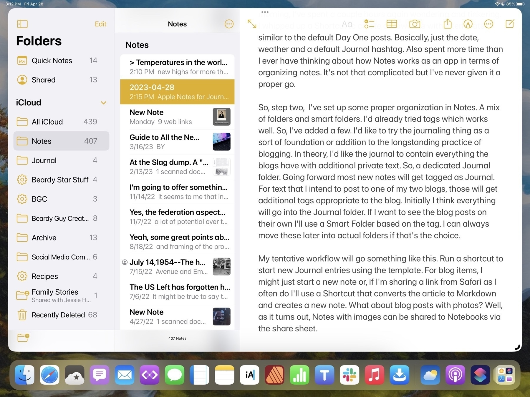
In the past I’d thought to try to make Notes work as a part of my blogging process. It didn’t quite take. So, this morning, I’ve spent a couple hours tinkering. I whipped up a Shortcut to create a new note with a template similar to the default Day One posts. Basically, just the date, weather and a default Journal hashtag. Also spent more time really looking at the organizing possibilities of Notes. It’s not that complicated but I’ve never given it a proper go.
Step two, then, was to set up some proper organization in Notes. A mix of folders and smart folders. I’d already tried tags which works well. So, I’ve added a few. I’d like to try the journaling thing as a sort of foundation or addition to the longstanding practice of blogging. In theory, I’d like the journal to contain everything the blogs have with additional private text. So, a dedicated Journal folder. Going forward most new notes will get tagged as Journal. For text that I intend to post to one of my two blogs, those will get additional tags appropriate to the blog. Initially I think everything will go into the Journal folder. If I want to see the blog posts on their own I’ll use a Smart Folder based on the tag. I can always move these later into actual folders if that’s the choice.
My tentative workflow will go something like this. Run a shortcut to start new Journal entries using the template. For blog items, I might just start a new note or, if I’m sharing a link from Safari as I often do I’ll use a Shortcut that converts the article to Markdown and creates a new note. What about blog posts with photos? Well, as it turns out, notes with images can be shared to Notebooks via the share sheet.
Any post, with or without a photo can be easily shared from Notes to Notebooks. So, once I’ve got a post ready for sharing I’ll just send it to Notebooks, hop over to iA Writer which has direct publishing to Micro.blog and Wordpress and which has access to my Notebooks folder. With a tap I’ve got the post open then another tap to publish. So, this workflow starts in Notes, ends in iA Writer and I have a copy in the Notes app as well as a discrete Markdown file in iCloud. Exactly what I want.
Downsides? Notes does not have built-in support of Markdown. Apps that do have that support provide convenient one-click formatting or keyboard shortcuts. But it's not all that hard to type the Markdown code when needed as it's designed to be simple. Notes tries to do fancy preview links which are nice but not what I want. I don't think there's an option to turn that off. But just pasting a url works.
Editing to add that after originally posting this to the blog someone on Mastodon chimed in that Everlog is another nice journaling app with Markdown support. I'm trying it out and it is excellent and doesn't have the flaws that Day One has. Now that I've got this handy-dandy Notes based system I'm not sure though that I want to abandon it.
Moft Snap Case and Snap Float Stand Review
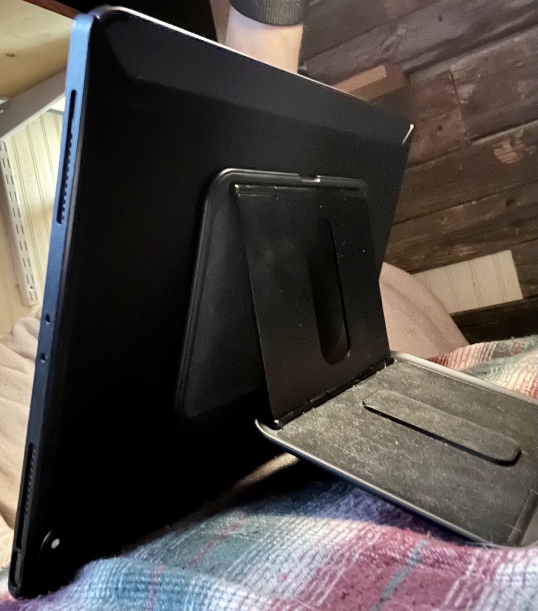
Several months ago I decided to try out a couple of iPad accessories from Moft. They have a series of products called the Snap System that are designed to work together. I bought the Snap Case and the Snap Float Stand. The various items can be purchased separately or in bundles. Their website is a little confusing when trying to create bundles.
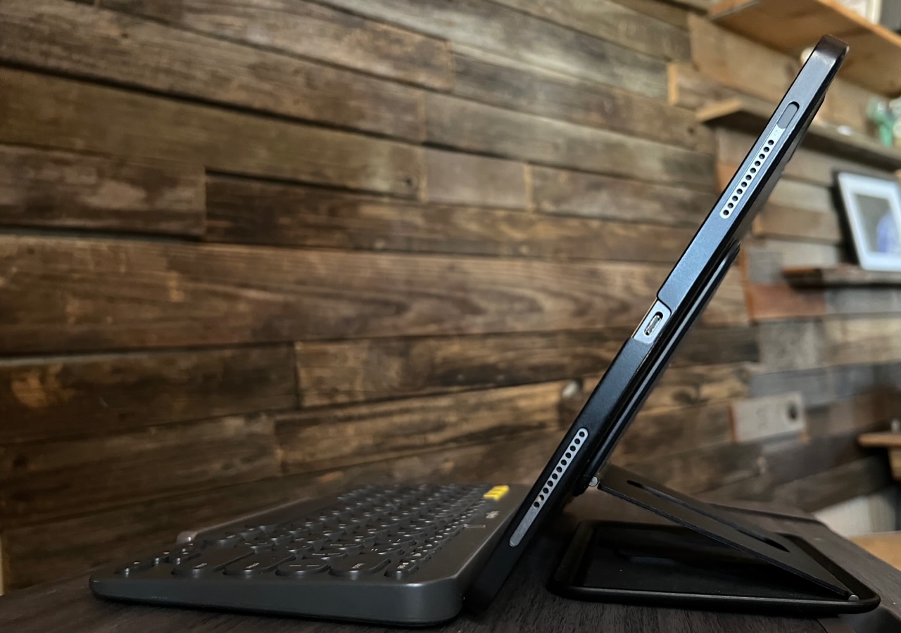
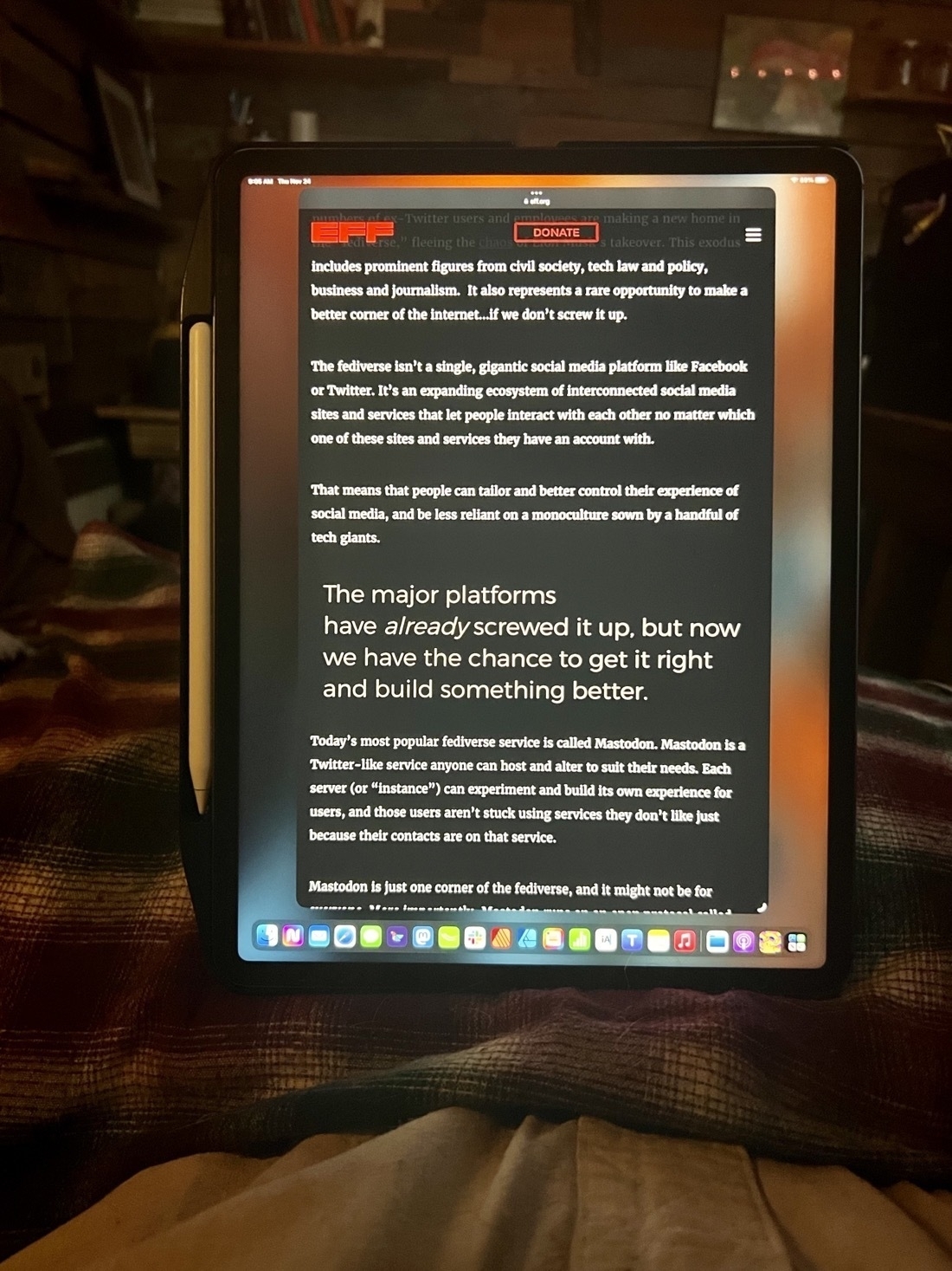
Of the various iPad accessories I’ve tried over the years I think this pair is my favorite. While I spend some time at a desk I’m often on a futon/beanbag and this combination works great in both places. In both situations it works well to be propped up at various angles in the horizontal or portrait positions. The float stand is also a kickstand that can be used in so many different orientations that it is basically without limit. And it’s very stable on a pillow in my lap.
A fairly typical configuration over the course of a day:
 iPad propped up in horizontal position, Pencil attached at bottom. This is nice as it keeps the bottom of the screen up off of the pillow and accessible for swiping.
 Flipped, the pencil on top.
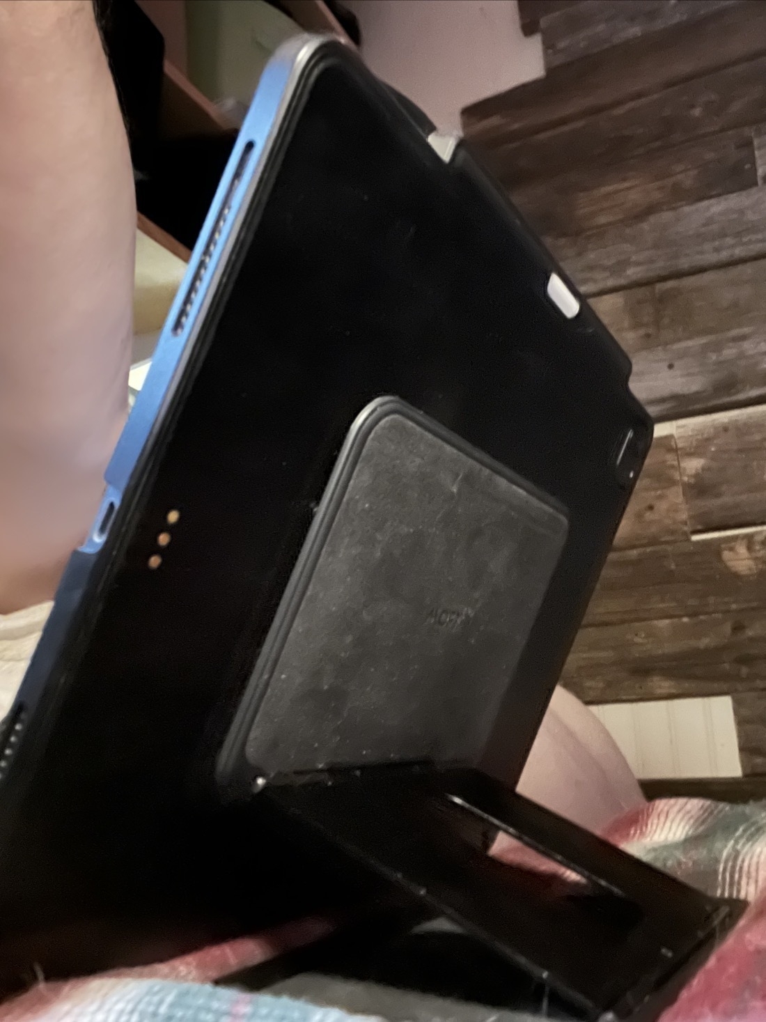 iPad propped up in horizontal position, Pencil attached at top
 iPad propped up in portrait mode
I find that with this case and stand I’ve been using the iPad as a tablet far more because I like having it propped up but without a keyboard in the way. If I want a keyboard I can just reach over and grab it. If I want a keyboard/trackpad I can attach it to the Magic Keyboard which is also nearby.
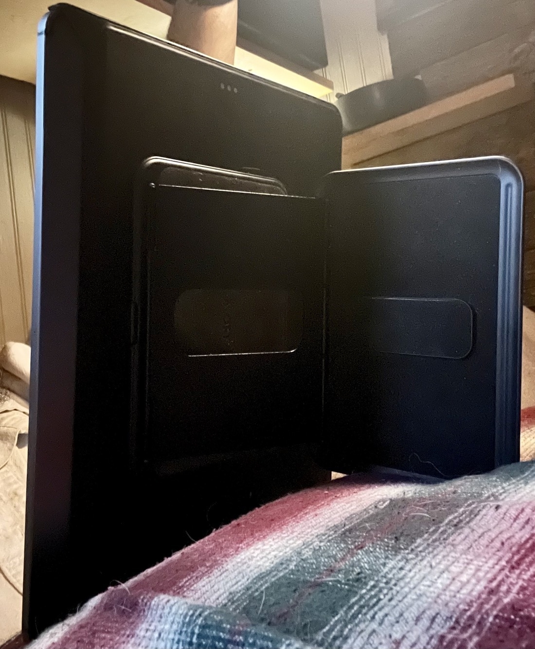
Because the stand and case are magnetic the stand pulls away easily. I did find that the embedded magnets in the Snap Case were not as strong as I wanted them and I was getting accidental detachments when readjusting the stand angles. Moft includes an extra sticky metal plate with the stand so I attached that to the case as it provides a much stronger connection that never comes off accidentally.
The Snap Case is really thin and Apple’s Magic Keyboard attaches just fine to the Snap Case and closes too though it bulges a bit with the added thickness. That said, because the case is so thin it’s not going to provide much protection in a fall though it does provide a bit protection in terms of daily wear along the edges and back-side.
A few last notes. First, the case also has a convenient spot for the Pencil. If you have a Pencil and like keeping it close by this is a nice addition. It also serves as an extra place to hold the iPad. Second, while the case provides access to the 3 buttons on the outer edges of the iPad it makes it fairly difficult to actually press those buttons.
In terms of durablity, I’ve been using the stand for most of the past 7 months and it’s held up very well. The hinges are as solid as the day I started using it.
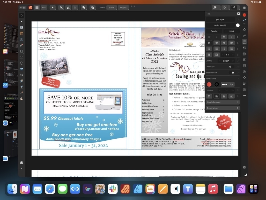
Affinity Publisher for iPad Review
Back in November I published a mini-review of Affinity Publisher for iPad.. At the time I’d only had a week to work with it but was happy with the app. It’s now been four months and I thought I’d offer an update. Serif have released 4 small bug fixes but most of the larger bugs have yet to be fixed. In my experience there have been just three bugs that have been a bit of a bother. The first, some fonts show up in Chinese characters instead of being displayed in English. Second, sometimes the app stops taking input from an external keyboard, restarting the app fixes the issue. The third really isn’t a bug at all because it’s specifically a problem related to using the app on an external display which Serif have said is not yet a supported feature. For now using the app on an external display is useless because the the right side context toolbar disappears anytime a tool is changed using the left side toolbar. Technically Stage Manager isn’t supported at all but I’ve found the app works fine with Stage Manager turned on.
In general the app has been very stable and usable in my four months of use. And to be clear, it’s not just usable, it’s smooth and responsive on the M1 iPad, 8GB of memory. Being able to work with touch, Pencil and trackpad is a real pleasure.
The foundation of Publisher was put down in 2019 with the desktop version of the app. It was a solid foundation offering excellent performance and a well rounded feature set.
Where Publisher really shines is in multi page documents and it has not disappointed in that role. Newsletters, reports, brochures, magazines or anything of that sort. I’ve also been using it for all my single page documents as it has linked text boxes and text wrap, two features not found in Affinity Designer which is what I would have used for single page designs previously.
The usual tools one expects to have with this kind of app are on the left toolbar. As you would expect, as you change tools the top toolbar changes to reflect the options associated with the selected tool. On the right side is a vertical stack called the context toolbar represented by icons that allow for the full range of options you need for whatever tool might be selected. So, for example, when you’re working with text you’ll see the most common tool options in the top tool bar but most of the options are only visible when you click to the text tool button on the right side context toolbar. Note all of the disclosure > icons on the right side. Tap into each one for another menu of text related options. Just as they did with Affinity Designer and Photo, Serif have done an excellent job translating the desktop interface to the iPad.
A powerful app like Publisher, by definition is more complicated than many other apps. I’ve seen people complain that Pages is too complicated and, well, Publisher does far more than Pages. This isn’t an app you’re going to open for the first time and suddenly understand. It can take some time to learn and remember all of the options. It took me several days of repeated use to remember which sub menus in the text tools contained which options. But as you use it you’ll see that the submenus are organized with purpose. For example, when I tap into the Leading disclosure triangle the resulting submenu is appropriately titled Spacing and it’s here that I can change the spacing around paragraphs and other options.
A word of advice if you’re just getting started, the built in help is also available on the web and it can be useful to have that open as it allows you to bounce back and forth between the app and the help while you’re working. The built in help system is located within the main app home page and unfortunately it’s not possible to access the help while working on a file In addition to the help Serif has also posted quite a few Publisher tutorial videos on their YouTube channel and these are worth checking out.
[caption id="" align=“aligncenter” width=“2048”] Another submenu while working in the text context sidebar is character and paragraph styles[/caption]
For many iPad users Apple’s Pages app is all that’s needed. That app has also had many features added over the years and is quite capable for laying out documents. I used it for years designing a wide variety of reports, newsletters and brochures. Affinity Publisher is a competitor to Adobe’s InDesign. It will open InDesign IDML files as well as pdfs for conversion to Publisher files.
Unlike Adobe’s various iPad apps, Publisher on iPad is the full app with the full feature set. Should you want to edit a Publisher file shared by someone or share to someone using Publisher on a Mac or Windows, it’s no problem as long as the file will be opened with version 2 of the app on those platforms (Files created by Publisher 2 or any of the Affinity 2 apps are not backwards compatible so cannot be opened by the version 1 apps. If you’ll be sharing a file with someone else be sure to confirm that they’ve updated to version 2 of the app).
Not only are files cross compatible between iPad, Windows and Mac, but all three apps of the suite can open files from the other apps. So, for example, it’s no problem to open a Designer or Photo file in Publisher. The file can continue to be edited and saved in its original format.
[caption id="" align=“aligncenter” width=“2048”] Notice the Publisher icon in the top left has been replaced by the Photo icon. Also the sidebars reflect the tools found in Affinity Photo.[/caption]
The last feature I’ll mention is perhaps one of the best. StudioLink, allows me to open up an a vector graphic in Designer or an image in Photo without actually leaving the Publisher app. It’s an amazing feature though it does require that you have all three apps installed to work. From within the Publisher app the other two apps are referred to as “Personas”. Open them up as needed by tapping the Publisher icon in the top left of the window where you’ll see a dropdown menu showing the other two apps. Choose the other app you need and the Publisher toolset will instantly change to the tools and features found in the other apps. Make adjustments to images from the Photos Persona, create advanced vector graphics or edit embedded vectors from within the Designer Persona. You have the full range of the tools found in the app you’ve “switched” to. When finished just tap back to the Publisher Persona to return to page layout. The transition is seamless and instant.
Serif has set a high bar with the Affinity apps on the iPad and Publisher allows all three to work together seamlessly. And at a time when Apple pundits continue to doubt the potential of the iPad as a powerful tool for creative work, Serif demonstrates what is possible.
If only those pundits could occasionally step away from the churning the rumor mill for a bit they might actually discover there are still innovative developers working hard to create valuable tools used by real people in the real world.
Serif’s Affinity 2 apps continue to be a fantastic bargain. Buy single apps or buy the universal license and use the Mac, Windows or iPad apps, no subscription, these are a one time purchase.
Easy scanning and OCR with Notes and Files on an iPad
I recently came across this thread on TidBITS looking for an app for scanning and OCR. The solution comes with every iPhone and iPad: Both the Notes and Files apps can scan and perform OCR automatically. Open Files and look to the top of the sidebar and tap the circle ellipses then “Scan Document”. The scanning app will autodetect each page and snap the scan for you then wait for the next. When you’re done tap save. Text detection is automatic and can be searched for within the Files app by opening the PDF.
Alternatively, using the Notes app, open a new or existing note and tap the camera icon in the toolbar to bring up the scanner menu. Choose the option to Scan Documents.
The difference between these two methods is that documents scanned into the Notes app are also indexed by Spotlight on the iPhone and iPad, and so are searchable both within the Notes app and just using the systemwide Spotlight feature. PDFs created by the Files app are not searchable in Spotlight.
It’s also worth noting that this is also a feature in the same apps on the iPhone. Additionally, almost any app can take advantage of what is, essentially, system–wide document scanning. The Notebooks app that I have been using recently allows for scanning documents, and importing with the OCR. So does Apple’s default mail app. And I’m sure there are others.
A simple but effective photography workflow on the iPad
Once upon a time, I was a happy user of Apple’s Aperture. I briefly tried Adobe Lightroom, but switched back to Aperture and used it until it was discontinued in 2015 at which point I transitioned to Apple’s new Photos. I’m not a professional photographer, photography is something I do for fun. By 2015 I was mostly just importing my photos, adding keywords, deleting and just doing a bit of minimal editing. And in 2023 that continues to be my process. Which is to say, I don’t spend a lot of time editing photos.
All that said, let me contradict myself. I do love photography and I enjoy sharing. 15 years ago that was primarily through Flickr. 2 years ago it was Instagram. Now it’s via my own blog at micro.blog. I’m taking the time to write this because a couple months ago I decided that it was finally time to start pulling in older images from my old Aperture Library that never made it into Photos. A few years worth of images, some jpgs and quite a few RAW files.
I suspect that many people working from an iPad will either use Photos or jump straight to Lightroom which is an excellent option for people that have the budget for a monthly subscription. I avoid Adobe because of the subscription model so Lightroom isn’t an option. But I wanted a few options not offered by Photos. So, after copying the photos over to an external SSD drive I turned to Darkroom and Pixelmator Photo to fill in the gaps left by Apple’s Photos app. Here’s the workflow that’s working for me.
For importing jpg images I just use Files to save to Photos. Quick and easy to do. For the RAW files I want to reduce the size of the file and convert it so I import from Files into Photos. But then I open Darkroom which allows has an option for exporting file quality and format. I’ve set it to jpeg 80% which typically results in files that are 800k to 1.2 mb. Perfect for my needs. The metadata remains intact. In my case with an older Canon it’s the date of photo, lens and exposure info and often location if I had added it. I select a group of images in Darkroom and then use the export option which saves them into Photos right along side of the RAW files which I delete. I’ll keep all of the original RAW and jpgs on the SSD as a back-up.
Next is to edit. Mostly I’m just using Apple’s Photos app for this. For images that require a bit more work, say, a photo of a bird that also has a portion of a bird feeder at the edge of an image, I’ll use Pixelmator Photo’s Repair tool which looks like a little bandaid up in the top right corner of the window. This tool is great for small imperfections but also works pretty well for even larger objects. Both Pixelmator Photo and Darkroom offer all of the other standard tools for photo editing such as saturation, highlights, shadows, etc. I’ve dabbled with them a bit but mostly just rely on Apple’s app.
The last step is the only step that currently requires the Mac and that’s batch adding metadata like keywords or captions. Photos on the iPad doesn’t do keywords at all and only allows captions to be changed one photo at a time. So for this step I’ll use Screens to connect to my Mac and use the Photos app there to add captions and/or keywords to groups of photos.
There are two iPad apps that offer options in this area of photo metadata. Hashphotos allows for adding keywords but unfortunately they are only stored in the Hashphotos database and not written into the photo files or the Photos app. That said, Hashphotos has some other, useful features so I wrote a mini-review. The other option is EXIF which offers a free and paid version. The free version will allow adding keywords and captions to photos but again, only one at a time. The paid version will do batch adding of keywords and captions. Exactly what I want except that it writes the info to the file itself which requires making a copy/duplicate of the file and for HEIC files from the iPhone it also requires that they be saved to jpg to change the meta data. I’m not inclined to do that.
So, for batch editing of metadata I’ll just continue using my Mac via Screens. It’s easy enough to do. Hopefully Apple will add these features to Photos for iPad.
The iPad works better if you learn how to use it
Continuing with my theme highlighting recent examples of Mac users having difficulty with the iPad. This was a recent thread over at the MPU Forums: My next iPad is going to be a MacBook Air! that consists primarily of disgruntled Mac Users who have, to some extent, tried making the iPad work as a Mac laptop replacement. In one of the most recent posts a user wrote this:
I was trying to create a presentation with PowerPoint pulling slides from different presentations. Very unintuitive and laborious. The iPad doesn’t need to be a Mac (or vice versa) but it does need to provide a smooth experience where I’m not focused on the device mechanics at the expense of what I’m trying to produce. I can’t help but agree with the group that says the device is hobbled by Apple.
That, to me, is an example of someone who’s not as familiar with iPadOS as they are with the Mac. His wording expresses exactly what seems to happen with folks who spend far more time with a Mac and less time with the iPad. When they do, on occasion, try to use the iPad they have to think about it more, they have to focus on the mechanics and as a result, it feels more difficult. For those of us that fully switch, there’s a moment in the process when the mechanics of the iPad become 2nd nature, like walking. The only time I have to think about the mechanics of the iPad is when Apple makes a big change like Stage Manager or when I start using a new app that does things differently.
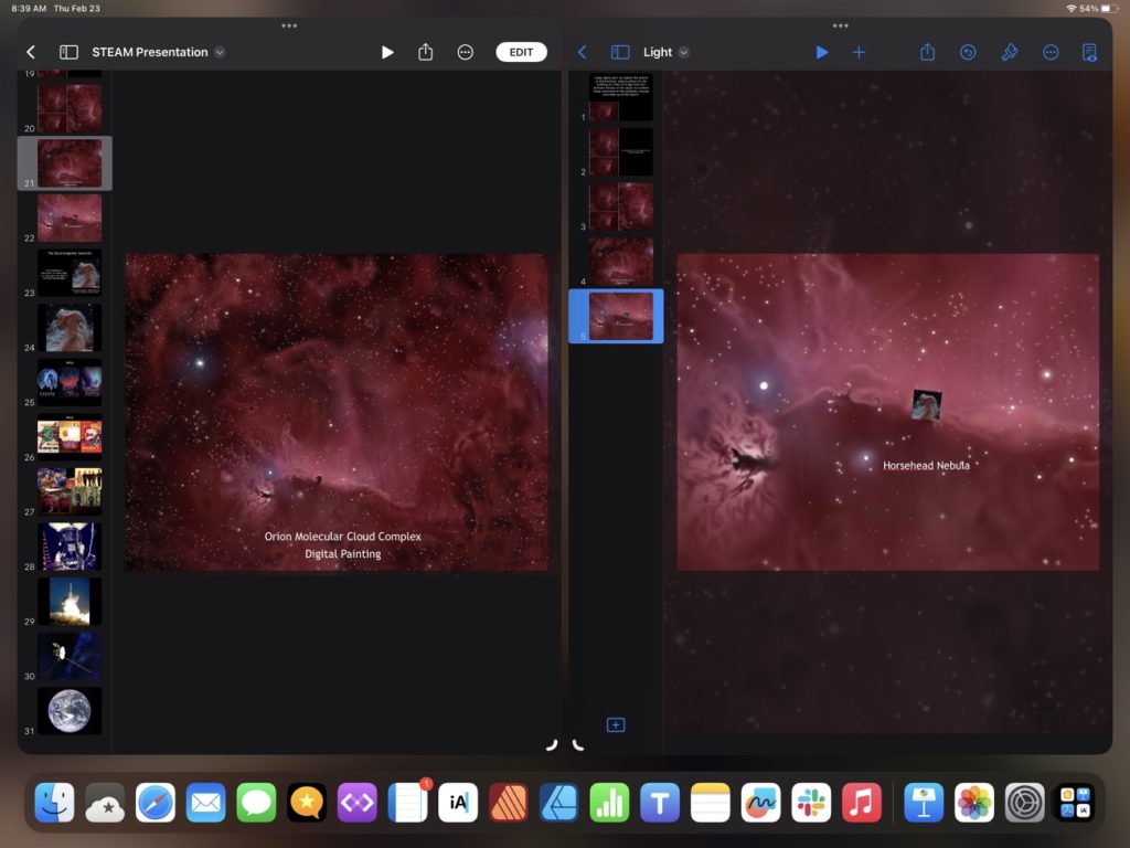
I can’t say a whole lot about PowerPoint as I’ve only used it a couple times on the iPad to check the export of a Keynote presentation to confirm everything was working before handing it over to a client. I do all my presentation work on Keynote and in that app it’s possible to open multiple files at the same time and simply select a slide from the sidebar, control click or long press to copy, then in the new presentation control click in the sidebar and paste. Or, even easier, just drag and drop a slide from one presentation to another and the slide is copied over. Stage Manager allows for 4 windows so I can have 4 presentations open. I’ve never needed to do that but it would be possible.
I only have the free copy of PowerPoint which doesn’t allow for editing but from what I can tell based on reading the Microsoft user forums the kind of multi-slide selection for copying or dragging and dropping between presentations isn’t possible. Sharing content between files in this way is easy in the various iWork apps on iPad and on the Mac too. Regardless, in the case above, the user was quick to blame the iPad rather than consider the possibility that the fault might be with the application lacking important features fundamental to the iPad experience.
It’s a long thread dating back to January 2022 and is full of examples of users for whom the iPad was never going to be a good fit because of their particular work flows or of users for whom the iPad, especially the iPad Pro with a keyboard/trackpad, would likely work well if the user had only taken the time to become proficient with the device and its OS. Proficiency and comfort with an operating system take time and effort and I would speculate that in many if not most cases the user simply is not making the necessary effort to switch. This is especially true with the latest versions of iPadOS which increasingly offer the features long requested by “power users”.
Exploring the Files App on iPadOS 16
I mentioned recently that I’d noticed a post on Mastodon by someone who was complaining how difficult it was to resize an image using iPadOS. I replied to point out that it was the exact same process and done with the same ease as it is on the Mac using the same app. With Files it’s simply two taps (or clicks with a trackpad). It seems a fairly common thing for Mac users these days to complain about the many ways that the iPad is not a Mac or is otherwise lacking. But what’s frustrating is that often times such critiques are coming from a lack of experience and knowledge as in the example above. Users simply haven’t taken the time to use the iPad and learn that many of the same features they use on the Mac are also right there in the same apps on the iPad. The Files app is an excellent example so I thought I’d explore it a bit.
Before I dig in I’ll just say that the Files app on the iPad did indeed start out as a pretty basic app (iOS 11, 2017) that was far, far short of the Finder on the Mac. But with each new version of iPadOS it has gained new features, slowly bringing it closer to feature parity with the Finder. I suspect that many mistakes are made by people who simply have not kept up. They used Files 2 or 3 years ago and not much since then.
It might be helpful to start with a comparison of the Files app on iPad to Finder on the Mac. I tend to use the column view the most.
While not identical, two apps are very similar in 2023 and in terms of functionality they are nearly the same. Both share most of the same elements with variations. The most noticeable is that everything on the iPad is larger because it’s optimized for touch so less is visible in a full screen window. But take a look at the sidebar in each. Aside from the difference in the order they contain the nearly the same elements: Locations, Favorites, Tags (not visible on the iPad due to size constraints) all of which can be customized in both apps. One interesting difference is that while Locations on the Mac is drive based, on the iPad Locations also includes app providers. So, for example, FE File Explorer on the iPad, if selected, reveals a list of FTP servers I use for connecting remotely to file servers to update websites. I can browse to any remote server from within the files app. Other apps do similarly. In the various screenshots below the Files app is on top, the Finder below it.
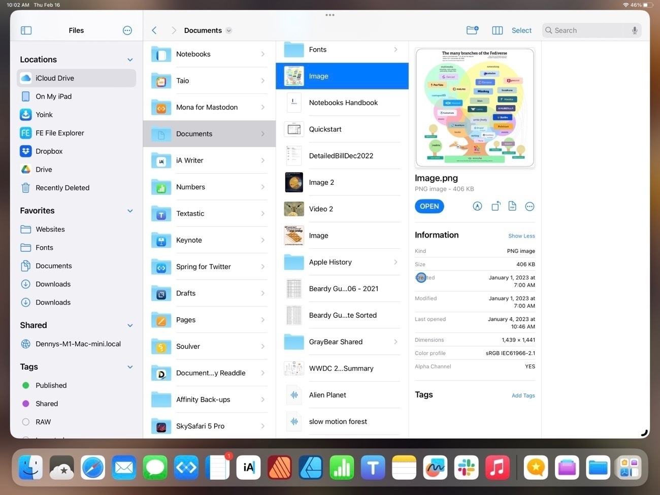
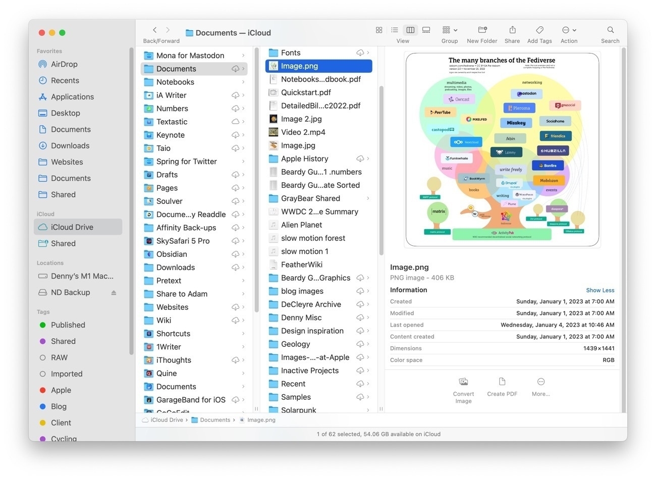
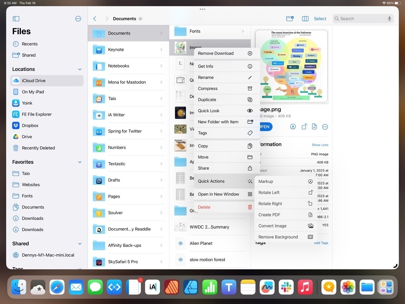
In the primary pane of the column view, again, nearly identical with variations in size and differences in the tool bar and presentation of the details in the right-most pane. Each has the same representation of file metadata but there are differences in the tools available. On the iPad, when viewing an image the tools are: Markup, Rotate, Convert to PDF and last the button to reveal more tools. On the Mac the default is Convert Image, Create PDF and reveal more tools.
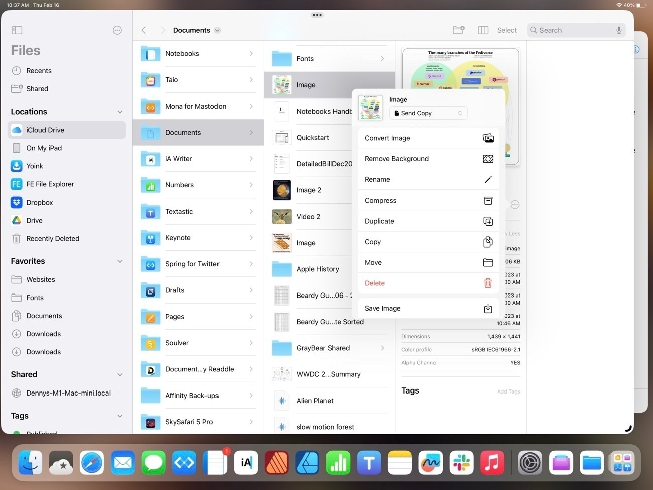
Upon tapping into the Reveal more on each we see that by default the iPad has a few extra options that are placed differently on the Finder (see 3rd screenshot below). Also, there are many additional customization options for sharing and Shortcuts that are not visible in the screenshot. On the Mac there are three defualt actions with the option to add more.
You’ll note that at the top of the Finder window is another Action button that reveals options:
For the most part the two apps are offering the same options and actions but in different locations. Here’s the contextual menu for a file on the iPad. As expected and similar to the Mac, it’s many of the same actions that are available in other locations:
And, not surprisingly, other options are the same between the two devices. For example, the space bar brings up Quick Look.
But the Mac Finder remains the better of the two in at least two areas. One, the customization of the top tool bar. The iPad toolbar cannot be customized and some of the options that we see on the Mac, while available on the iPad are only accessible by tapping the 3 column icon which reveals list view, icon grid view, sorting and grouping:
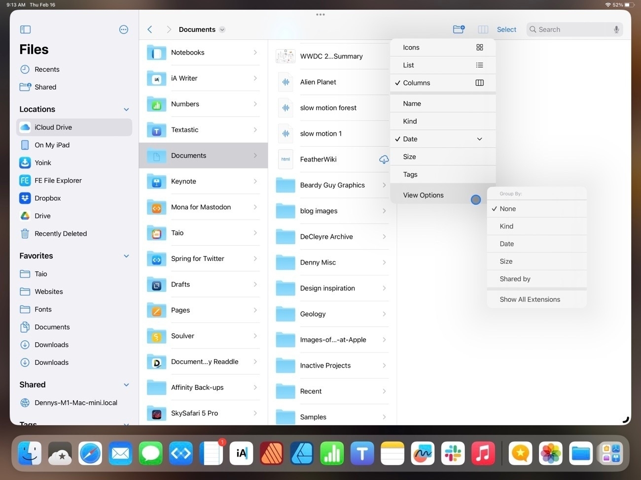
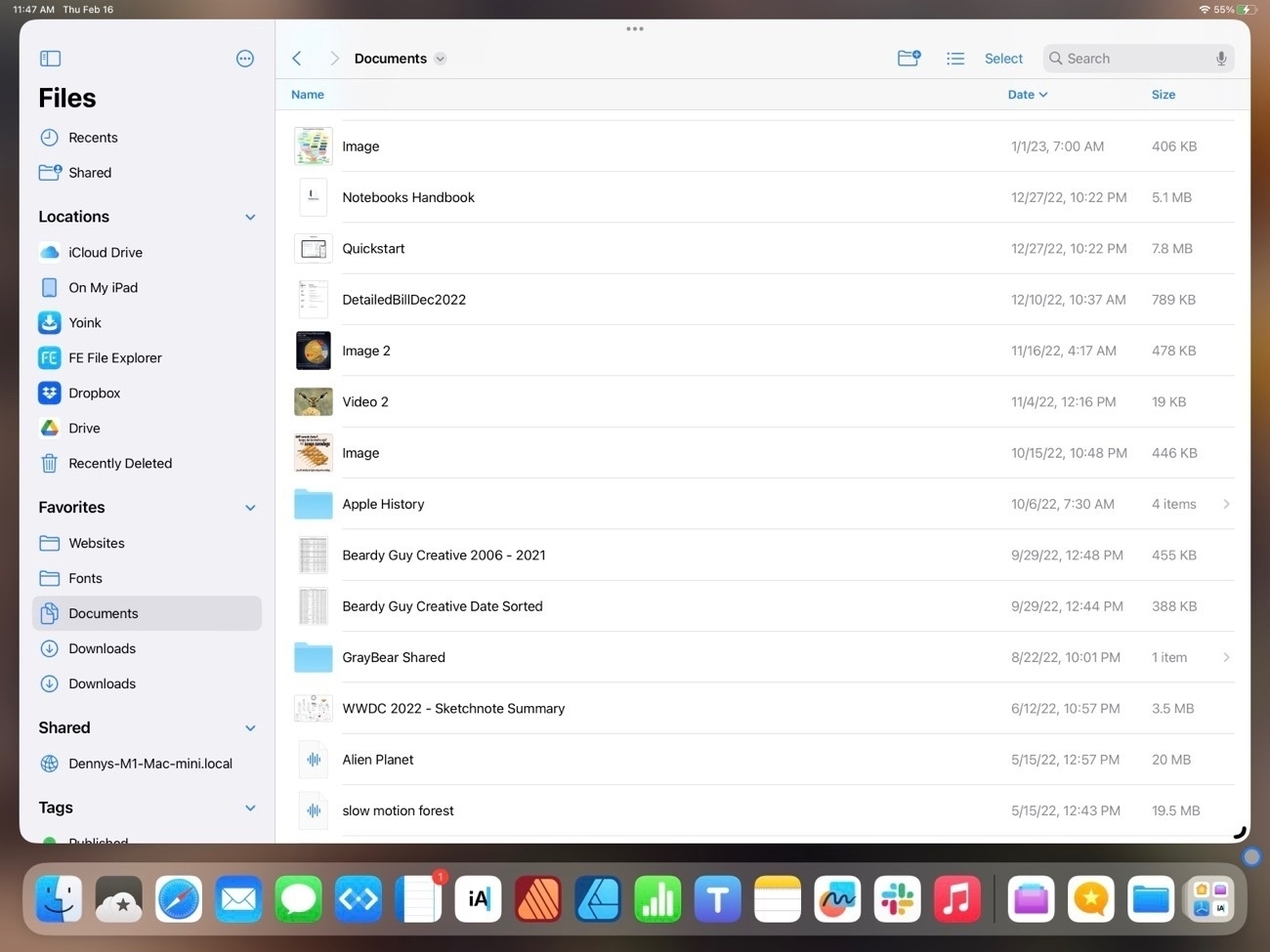
Also, the list view of the iPad is still really limited when compared to the Finder on the Mac. Currently there are three columns available with no possibility for additional columns. If a user chooses to sort by kind or date the column that is displayed changes to reflect the sort. On the larger iPad it would seem there is room for a 4th column.
One advantage the iPad has over the Mac is the additional options in Quick Look on the iPad when viewing a pdf. These options are on the Mac in the Preview app but on the iPad a pdf can be edited right from the Files app Quick Look, a nice convenience:
In previous years one complaint about the Files app was the lack of proper external drive support. That was remedied in iOS 15:
So that’s Files on iPadOS 16. It’s come a long way since the early days. I think it’s fair to say that for most users it’s just as easy and functional to use as the Finder on the iPad. While it can feel cramped on a smaller iPad screen or on a 13" iPad when using 2 Files windows, this is a limitation due to the increased size of the touch interface I don’t see that as something Apple will be able to change.
I would like to see a more customizable tool bar and additional options for the columns that are visible in list view. Possibly an option for smaller touch targets, a kind of Files specific “Show more” view that would shrink the size of icons and text. Lastly, more consistent indexing of the content of files. Currently searching the Files app returns a mix of results depending on the content the app resides in. Some apps seem to provide an index that includes content, other apps only Filenames.
Oh, and I’d love to see Files renamed to Finder or, at least given the Finder icon. I understand that the Files name and generic icon matches the actual use of the app better. You may have noticed I’ve created a Shortcut for opening the Files app and have given it a proper Finder smiley face where it resides in my Dock. It’s as it should be.
Notebooks 12 Reviewed and Compared
I’ll admit I have a habit of collecting text/notes apps. It’s one of my most used categories of apps because it’s what I use for blogging. I’m fairly certain, based on posts over at MacPower Users as well as on blogs I read that I’m not alone in my habit of collecting such apps. That said, I do try to settle into an app for awhile. I don’t actually want to switch all the time, I just enjoy trying the different possibilities.
When it comes to text/notes apps I generally have four jobs in mind.
For context, here’s a list of text/markdown apps I’ve used over the past few years, beginning with most recent favorites and how I use/used them. Note: When I first started this post I considered writing reviews of all of these apps but then I realized, I’ve written about all of them at least once before, many of them I’ve likely mentioned in numerous posts so there’s probably not much point.
I came across Notebooks in late 2022 in a thread on the above mentioned MPU forums. I wasn’t looking to change and had been fairly happy with Taio. So why did I make the move? As a markdown editor Notebooks is very similar to Taio and iA Writer. On that alone I could just as easily stayed with either of the other two apps. The additional features that initially prompted the change:
With those five features Notebooks might also be a gradual replacement for Apple’s stock Notes app and even the Reminders app. A sort of bucket-app for referencing and indexing a variety of files.
Before I dig in I’m just going to note that there’s a great deal to this app so what I’m writing here is just scratching the surface and is based on the things I’ve enjoyed or found useful in just a couple weeks of using the app. So, really, it’s just a mini-review. For the a more full description I’ll point again to the Notebooks website.
The sidebar, organizing and browsing files A pretty typical UI element in these sorts of apps is a sidebar showing folders and files. I consider it to be an important part of the UI because it’s something that is used often and is looked at often. iA Writer does the sidebar really well. Functional and visually pleasing. The sidebar in Taio is functional but feels a bit clunky. The sidebar of Notebooks is between the two. Not quite as compact or clean as iA Writer but it does offer more functionality with several default Smart Books for Favorites, Recent Items, Contexts/Tags and at least one dynamic list that will show up at certain times for due tasks but disappear when there are no due tasks. There’s also a helpful sorting header for quick sorting of folders and files. Finally, a global documents search at the very top. So, while it takes more vertical space it is more functional and still looks very nice. In addition to marking a file as a favorite for display in favorites smart book it’s also possible to pin files for quick access.
I’d initially missed that Notebooks offers tagging. It’s presented as “Contexts”, sort of in the GTD (Getting Things Done) realm of organization. But in an exchange I had with the developer Alfons (who, by the way has been very helpful in a series of email exchanges) he kindly pointed out the feature so I’m adding it to the review. I’ve turned it on and as I have no use for the contexts I’ve removed those and am adding my own to reflect my needs as a blogger/writer. Now, to be honest, I’ve tried tagging off and on with numerous apps and have always struggled to develop a system that works for me. So, I’m not sure if this will stick.
Files can be set to default to editing mode or in the more visually attractive rendered appearance. I’ve chosen the latter as it makes for a more enjoyable experience when looking through documents. With just a tap or click in the text area of the file it switches to editing mode with the cursor at the position of the tap or click. Another benefit is that if you choose the other option, to default to editing mode, you’re making extra work because to view your rendered document you have to click twice to switch to that mode. May not seem like much but I find that it’s much easier to just click once into the document and type than to click a button then another button.
I’ve set up several “Notebooks” in the app which, when viewed in Files are just folders. Currently I’m using a generic Blog folder for published files. Other folders correspond to several blog archives, podcast transcripts, help documents that pertain to the Notebook app and two to-do lists (more about that later). If you click into a Notebook and create a file then of course the file will be created in that Notebook. I generally start in the default, general area and move files via drag and drop as needed.
Getting content into Notebooks This is fairly easy and can be accomplished in a variety of ways. From the Files app select a file and, using the share tool, select Notebooks. The file will be copied to the default Notebooks folder. It’s possible to copy and store iWork documents: Pages, Numbers and Keynote or Microsoft Office docs. The same for pdfs, images, movies, or audio. Once in Notebooks tapping a file in the sidebar will open it up as a preview in the main window. Tap and hold the file name or select the share icon from the top right of the window allows for “Open in” to open in the default app. Any changes made will be reflected in the Notebooks app once the file is saved and then opened again in Notebooks.
I’ve also set up several shortcuts for sending quoted text and links from Safari to new files in Notebooks for easy and quick linked posts for blogs.
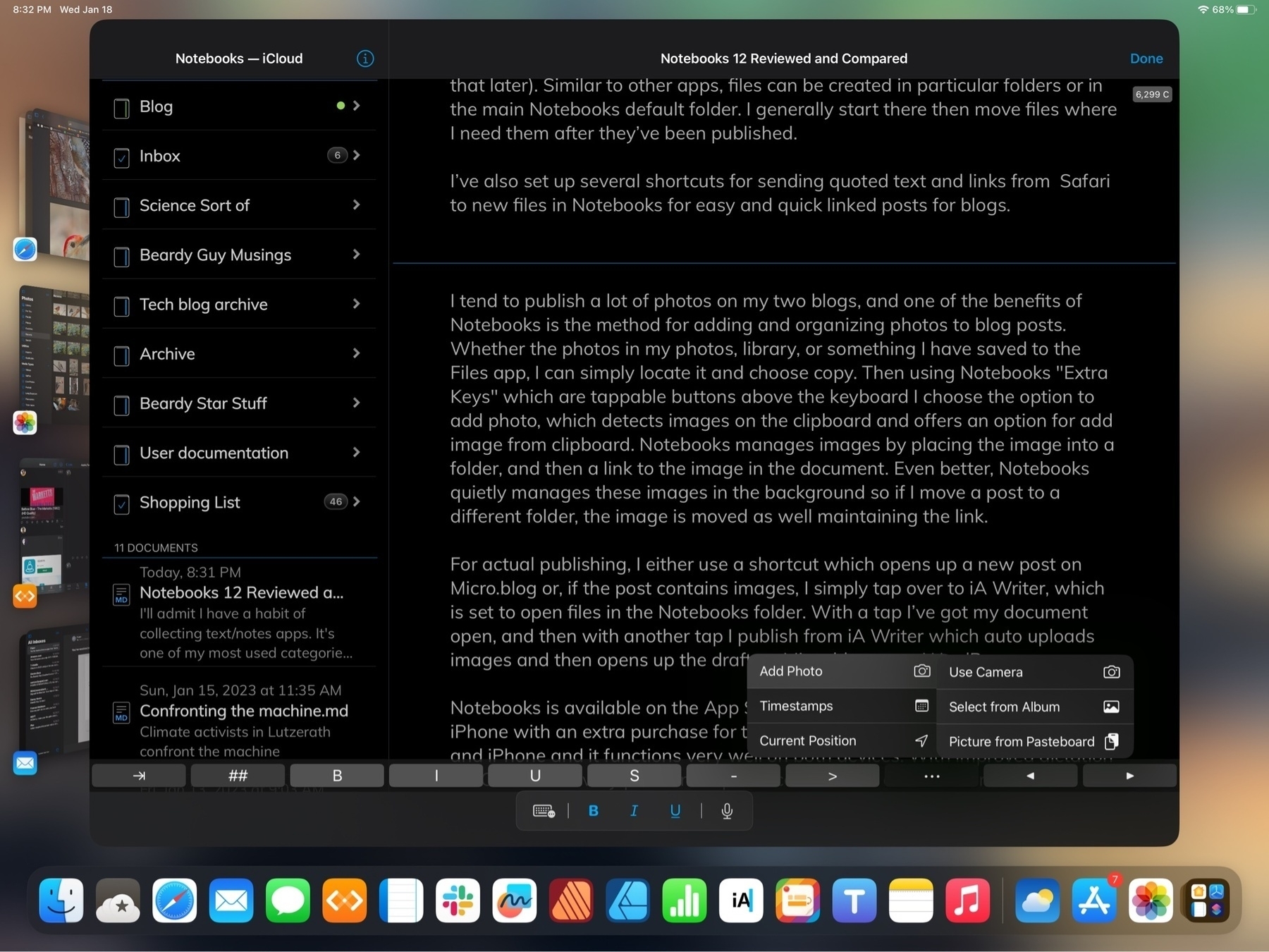
I tend to publish a lot of photos on my two blogs, and one of the benefits of Notebooks is the method for adding and organizing photos to blog posts. Whether the photos in my photos, library, or something I have saved to the Files app, I can simply locate it and choose copy. Then using Notebooks “Extra Keys” which are tappable buttons above the keyboard I choose the option to add photo, which detects images on the clipboard and offers an option for Picture from pasteboard. Notebooks manages images by placing the image into a folder, and then a link to the image in the document. Even better, Notebooks quietly manages these images in the background so if I move a post to a different folder, the image is moved as well maintaining the link.
For actual publishing, I either use a shortcut which opens up a new post on Micro.blog or, if the post contains images, I simply tap over to iA Writer, which has the option for “Added Locations” outside of the default iCloud location for iA Writer files. I’ve added Notebooks as one location so I can easily tap into all of my Notebooks folders. With a tap I’ve got my document open, and then with another tap I publish from iA Writer which auto uploads images and then opens up the draft on Micro.blog or on WordPress.
Tasks in a note app? Yep. Notebooks has a pretty interesting and powerful system for tasks built in and I’m giving that a try. I’m not a heavy user of task apps and I’ve gotten by pretty well with Apple’s Reminders app for tracking a handful of repeating tasks. I’m giving the feature a try in Notebooks and so far I like it.
Is there a benefit to having to-dos in Notebooks? With Apple’s Reminders app I am restricted to the predetermined format for every reminder. It works pretty well but it can be a bit cumbersome when using the little pop-up window with set fields. Notebooks offers a variety of more flexible ways to create and track tasks.
One step for getting started with tasks in Notebooks is to set a default task list. Usually this as an Inbox but you can use any name for the default. This is where tasks will be sent when using Siri if you don’t specify where to send a to-do. It’s also possible, in any current text document in Notebooks to select text and then, using the pop-up context menu, select Add to Inbox. Whatever text is selected will be added as a task to whatever list you’ve designated as the default task list.
A second option: Designate any notebook as a task list. You can have as many of these lists as you like. Within each list any markdown file becomes a list item that can be given a due date/time, an alarm, etc. When you navigate to that Notebook/list you’ll see your markdown files but they have a small open circle button next to them indicating that they can be tapped to be checked. A single tap puts a dot inside to indicate that it is in process. A second tap puts a check inside to mark it as completed.
With Notebooks a markdown file in a notebook specified to be a task list is tracked as a to-do. This can be as simple as a one line description or, if a task is somewhat complex, a small document can be written as a detailed note with embedded photos, linked files (pdfs, Pages, Word Docs, etc), links to web pages. Almost anything. The task can be assigned a due date/time with an alarm as well as be marked as repeating. Siri works with Notebooks generally and this includes adding items to task lists.
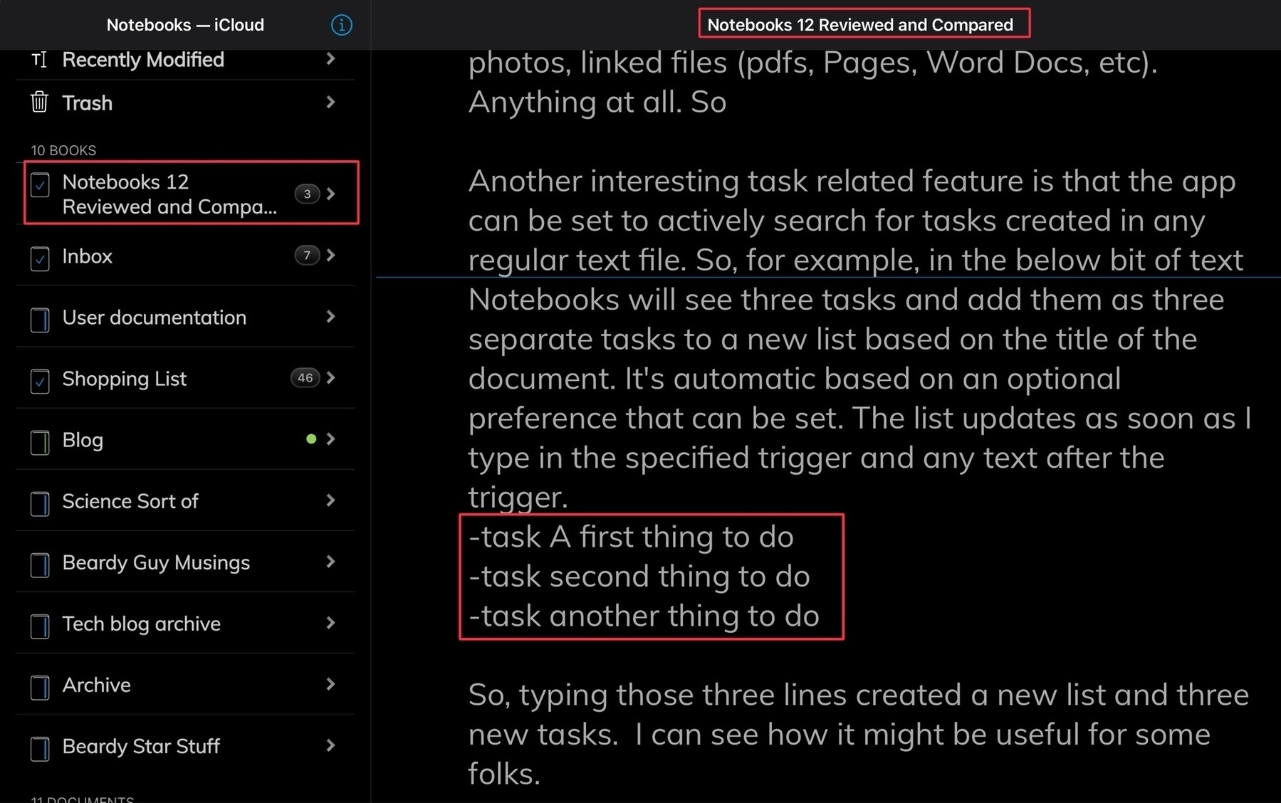
A second way to set-up a task list begins with a setting in preferences to tell the app to actively search for tasks created in any regular text file outside of a designated list. So, this document is just a standard markdown document but in the below bit of text Notebooks will see three tasks and add them as three separate tasks to a new list based on the title of this document. It’s automatic based on an optional preference that can be set. The list updates as soon as I type in the specified trigger and any text after the trigger.
✓ A first thing to do -task Order needed item on http://amazon.com ✓ another thing to do
So, typing those three lines created a new list and three new tasks. I can see how it might be useful for some folks or certain multi step projects.
As you do those tasks and mark them completed they will be updated in the original document with a check mark. So, in this way, a document could serve as a kind of project manager that can update a list of tasks and which is updated as those tasks are marked as completed.
Or, if you’re working on a document and decide you’d like the whole document to be converted into a series of tasks you can choose to do that with a couple of taps.
There are a lot of options for the tasks features and several settings. I’d at first assumed that the task feature was something simple that would be a nice to have but have since realized that it’s really quite a powerful set of features. For someone spending a lot of time in Notebooks it probably makes a lot of sense to switch to the app for task tracking.
PDFS I mentioned above that Notebooks indexes the content of pdfs making them searchable. It’s also possible to link to pdfs from within a markdown document. And, lastly, when opening a pdf in Notebooks there is full support for all of the features one gets when opening a pdf in the Files app. In the pdf sidebar it’s possible to tap on a page and rotate, add new pages, remove pages, import new pages from another document, etc. Markup is also available on pdfs right in Notebooks.
Getting content out of Notebooks When it’s time to do something with content you’ve created Notebooks has quite a few options which are locating in the “Process” menu. For exporting a non editable document there are two options: PDF, ePub. It’s also possible to “duplicate as” these file times which creates a new document that can continue to be edited as plain text, html, Latex and RTF. All excellent options.
For something as well featured as Notebooks I wish it had publish features. Being able to output to WordPress or other blogging platforms would be great but that’s not exactly an expected or common feature.
Notebooks is available on the App Store as a one-time payment and is universal between iPad and iPhone. The Mac app is a separate purchase.
Some iPad users really should just use a Mac
And so it goes, Federico Viticci continues to be unhappy with the iPad. With that article as wall as his other recent posts and podcasts and I can’t help but conclude that it’s probably time for him to move on to the Mac. Same for many of the other comments I’m seeing on Mastodon, etc. There’s also this post by Hey Scotty, a fellow micro.blogger.
And really, I don’t think it’s all that confusing. The initial iPad was meant to be a casual, easy to use device that sat between the iPhone and a Mac. Mostly for consumption but Apple also sold the Keyboard Dock and had the iWork apps available from day one (at least Pages, not sure about the others). So even then they knew it had potential.
Fast forward 6 years and the device is getting more powerful and they release the larger iPad Pro. And it just goes from there that the hardware is obviously very powerful and Apple, noticing at least a small group of users are increasingly enthusiastic about the device as a full-on computer.
From there it’s just a process of Apple protecting the ease of use for the vast majority of iPad users that want that easy, casual, non threatening computer while, at the same time, offering new features for the “power” users. Year by year adding those features pretty steadily,
The “problem” is that the tech enthusiasts tend to have the loudest voice. Thanks to his website and the many podcasts he’s hosts, Federico’s voice and opinions are greatly magnified. And over the past couple of years he’s become increasingly disgruntled. The iPad simply does not meet his very particular needs, preferences, tastes. But again, his disgruntlement is the loudest opinion.
Setting aside all of the users the iPad was originally aimed for, I’d guess that there are lots of very satisfied “pro” users of the iPad today who are actually quite happy with the device but who’s voices are greatly muted in comparison to the very opinionated guy with the bullhorn.
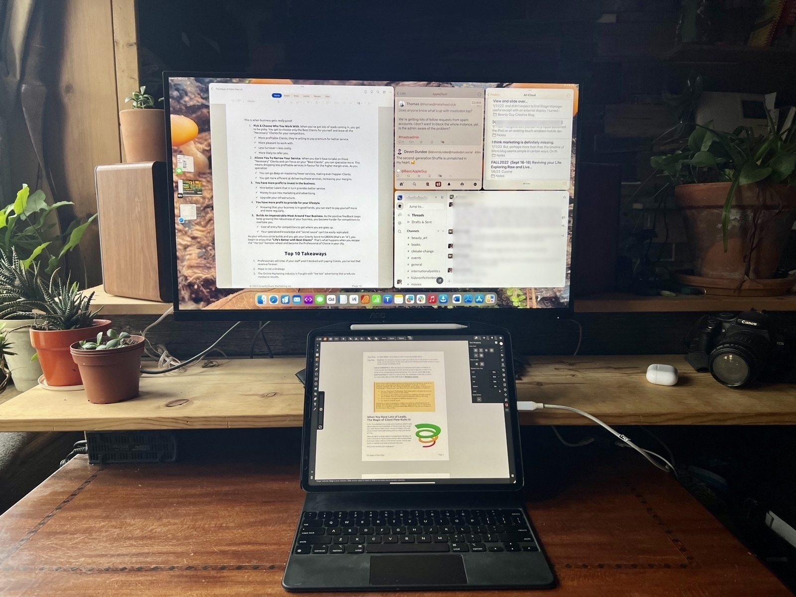
I really love iPadOS and the iPad form factor. I’m not conflicted or angry about the state of Stage Manager or multitasking. I’ve been watching with great appreciation as Apple has, year-by-year, increased the features found in important apps like Files, Mail, Safari, iWork, etc. For me it’s only getting better. And now, with Stage Manager and full external display support, it’s the mobile touch tablet that can be a laptop or a desktop computer in seconds. Attached to an external display I’m able to see more and do more as I’m doing in the photo above working with two Numbers spreadsheets, each of which has a lot of columns across and thousands of rows. Stage Manager on an external display makes my hours of work on these documents more efficient. It’s a huge win for me.
It’s a shame that the iPad isn’t doing it for Federico and others. For them it would seem the Mac is the better choice. That’s fine. It’s can’t be for everyone. Just as the Mac isn’t for everyone.
HashPhotos Review
One of those tasks I’ve never been consistent at doing is culling duplicate or near duplicate images from my Photos library. It’s been on my mind recently that I need to tidy up and bring in some older photos stored on a backup drive in my old Lightroom and old Aperture libraries.
HashPhotos was mentioned on a recent episode of the iPadPros podcast and it’s proving to be a fantastic compliment to Apple’s Photos app. I’m not a fan of Adobe’s subscription model so I don’t use Lightroom which many use for this kind of management.
HashPhotos is an ideal tool for finding exact duplicates and very similar, near duplicate images. The app will scan your photos library then present what it found allowing you to browse through with similar images side by side with the option to enlarge them for magnified comparison. It works very well for zooming in both images to the same spot and same magnification at the same time allowing you to determine, for example, which images have the sharpest focus.
HashPhotos can also be used alongside of Photos with it’s own, additional metadata options such as Memo and keywords. Unfortunately this metadata seems somewhat limited in usefulness. The keywords assigned are not written to the photos database so it will only work in HashPhotos. But it is very easy to add keywords to batches and navigating the library with keywords in the app is helpful. I’m not sure what the memo field is useful for.
What is far more useful is batch metadata editing for location and photo date. Perfect for older digital or scanned photos and easy to apply to large numbers of photos at once.
In general the HashPhotos provides a helpful and enjoyable alternative Photos browsing experience. It’s also worth mentioning that the app offers photo editing though I’ve not explored this yet.
What I wanted was an app that would help me work more quickly to find and remove duplicates as well as a way for adding location data and for changing image dates and HashPhotos does exactly this. I’m satisfied!
Talking Affinity 2.0 on the iPad Pros Podcast
Tim Chaten invited me to join him on his podcast iPad Pros to talk about the new Affinity 2.0 creative suite. Affinity is notable for bringing its Photo and Designer apps to the iPad several years ago. In contrast to Adobe, Serif’s apps were fully featured and equal to their desktop apps. They set the standard for design apps on the iPad and the new Publisher 2.0 for iPad raises the bar even higher. It was a fun conversation and my thanks to Tim for inviting me on!
Affinity Publisher for iPad mini-review
Serif recently released the long anticipated major updates to its Affinity suite of creative apps bringing them up to version 2.0 and adding in a new Publisher app for the iPad bringing it up to full parity with the desktop app suites.

I’ve used Affinity Publisher for the iPad for a week during which time I’ve imported several of my regular, client projects, mostly, newsletters. And yesterday I just finished off a marketing one sheet and a newsletter. For the newsletter importing from the Mac version of Publisher 1 was easy, no issues. Importing from a pdf also worked very well with various images, text, shapes, etc mostly intact. Exporting the final pdf was fast and as expected. Exporting a Publisher package also went without a hitch with the expected folder of linked images, fonts, and the package file.
Publisher on the iPad works exactly as it does on the Mac with the exception that instead of the top level menu the iPad has the touch, optimized tools and what Affinity refers to as “Studios” on the right side of the window: Layers, Pages, Colors, Text, Stock Photos, Assets, Text Wrap, etc.
Using the “more space” option in the display settings on the 13 inch iPad Pro has the effect of making some of the touch points fairly small, even in full screen. Fine for using with a trackpad or Apple Pencil, but a little bit difficult with the fingers when, for example, selecting layers.
Somewhat surprising to myself is that I did most of the two projects yesterday in tablet mode using the Apple Pencil and my fingers to select text from documents provided by client to place or paste into the publisher document. It works very well and I am reminded why I enjoy using the iPad so much for this kind of work. It’s a very smooth and quick experience alternating between a pencil and fingers as needed to select, move, copy, drag and drop from Files, est. Oh, and notably, moving between pages, and using touch to zoom in and out of details on a page was super smooth just as it’s always been on the Photo and Designer apps by Affinity.
Looking forward to trying it out on an external display when 16.2 is released. I tried the trackpad a bit while importing and updating some of my other projects and it also works very well (as expected).
Not too much of a surprise for a new app there are a few issues. In my case I noticed a few font issues which others are also reporting. I also had a few app crashes though I’m using Stage Manager so it’s possible that might have been related. With the next project I’m going to use it without SM to compare. Oh, and the top toolbar is hampered by Apple’s 3 dot window dropdown widget which gets in the way of any button underneath it. Hoping I do find that 3 dot window widget useful but hope Apple increases the window chrome just a small bit at the top of windows because it’s something I accidentally tap far too often in many apps. Guessing I’m not alone there. So, not really an Affinity app specific problem.
All in all, I think Serif has done an excellent job and, with Publisher on iPad, my full workflow is now possible on that device. My Mac will be officially retired to file/media server backup. For Mac users I have no doubt that the 3 new Mac apps are all solid upgrades. And I expect Serif will be fairly reliable in releasing bug fixes for all the platforms as they’ve done so in the past. For a one-time purchase it’s a fantastic deal if you’re someone that needs these kinds of apps.
Quick Start Guide for Affinity Publisher 2 for iPad
The Universal license provides access to all the V2 apps on all the operating systems: Mac, iPadOS and Windows is 40% off for a few weeks, only $100. A bonkers good deal!
Affinity 2.0
Exciting day for users of the Affinity suite of creative apps, especially #iPad users. Serif have released the new 2.0 suite which includes Publisher for iPad. Publisher was previously only available for Mac/Windows. So, now all 3 desktop apps have been updated and all three are also updated and available on the iPad. I’ve already imported a project from my Mac into Affinity Publisher on the iPad and it’s fantastic.
If you're not familiar with the Affinity apps, they are Photo, Designer and Publisher and are similar to Adobe's Photoshop, Illustrator and InDesign. I dropped Adobe several years ago and have never regretted it. The Affinity apps have met my needs. Not only are they fully featured but in my opinion are far more responsive than the Adobe apps. The apps on the iPad set the bar for what professional creative apps can and should on iPadOS.
No subscription and they’re offering a launch special, all of the apps (a universal license), desktop and iPad, for $100. I think that includes Mac and Windows apps as well. Or buy the individual apps at 40% off the future full price. I don’t think I’ll use the Mac apps much but bought the universal license anyway.
Switching from a dedicated financial ledger app to Numbers
A few months ago I posted about my switch from FileMaker Pro to Numbers for my client invoice tracking. It’s worked out very well. Recently upon opening the iFinance app where I track my banking I was greeted to a message that there was a new version available. The amount is not too much but my current version works fine and browsing through the changes I didn’t see anything new that I needed. But it brought to mind that it would mean that the current version wouldn’t be seeing any more updates. Not a problem for now but perhaps in the future with OS updates. So, I had a similar thought, why not try to move my banking to a Numbers spreadsheet?
My needs are pretty basic. I wanted to mimic iFinance. I exported each account to a CSV and imported into Numbers. Then I created a master account file and set-up multiple sheets, one each for the various accounts. So, for example, Cash, Apple Cash, bank, PayPal, credit card, etc. Each is a simple line-item ledger that keeps a balance along with the usual: date, description, payee, category and note if needed.
[caption id="" align=“aligncenter” width=“800”]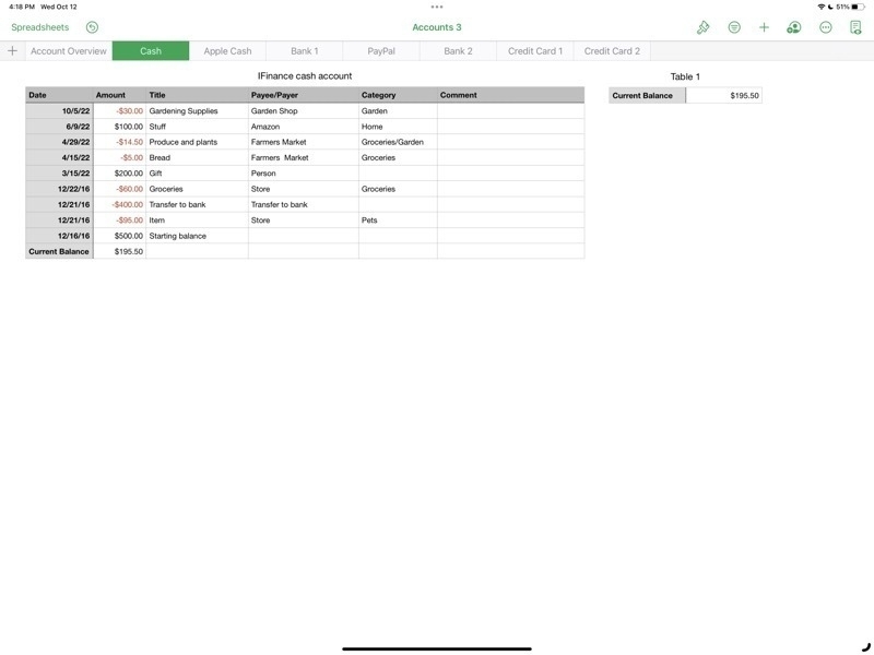 The table for cash on hand. Different accounts are visible in the top row of sheet tabs.[/caption]
[caption id="" align=“aligncenter” width=“800”]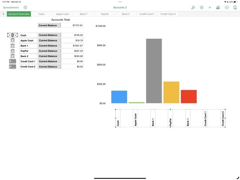 The Account Overview shows the current balance of each account as well as a bar graph.[/caption]
Stage Manager for iPadOS is coming together
For the iPad enthusiasts that are tuned in to the various pundits of Twitter, YouTube, Blogs, Podcasts, the common narrative is that Stage Manager is a hot mess of bugs, poor design, etc. While I'd generally acknowledge that it's been buggier than recent years' beta cycles I don't think it's the dumpster fire some are making it out to be. A few thoughts.
Windowing: Free form or tiled
Some will like overlapping windows, some won't. Notable iPad enthusiast Federico Viticci doesn't seem to like overlapping windows and was hoping for tiled windows instead. I do like the idea of tiled window options as an extension of the current 2 window split. Having options for 3 or 4 windows in splits might work very well. That said I think the current implementation is a good start.
As currently implemented one a general opinion seems to be that truly free form windows would be better than Apple's attempt to manage windows for users with a kind of size snapping and window juggling that seems hard to predict. Apple's goal is to make it easier but it may be that it's actually just making it harder. I think it's still a work in progress and I'm not sure if I have a preference. But I do think that with the last beta the behavior is better.
The Dock and side strip of recent app spaces
In regards to the bottom dock and the side strip of recently used apps, I like that there are options here to hide one or both in stage manager. What I'm finding is that I like to leave both on because I always have the option to size windows such that they can occupy the full screen, temporarily hiding both the dock and the strip as needed. It's easy to use a finger swipe or just push the cursor to the bottom or side to bring forth either as needed.
The Home Screen and Stage Manager
Like many who have noted, I agree that it seems silly to blur the Home Screen when using Stage Manager. Also, as noted by others, when tapping or clicking the Home Screen behind a window, it would seem to be an expected behavior that this would hide/minimize the current windows and reveal the Home Screen.
Other notes on recent betas
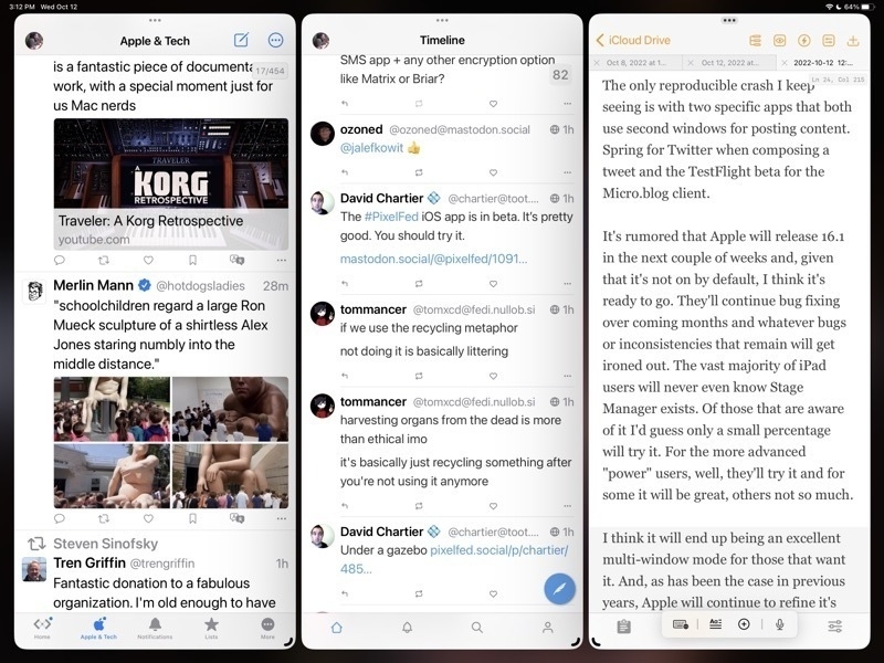
I'm seeing a lot of improvement, as we would hope and expect, in the latest beta released on October 11/12. Happy to see the return of the feature enabling a tap at the top of a window to quickly scroll to the top. Generally it's been very stable with fewer bugs or confusing behaviors.
The only reproducible crash I keep seeing is with two specific apps that both use second windows for posting content. Spring for Twitter when composing a tweet and the TestFlight beta for the Micro.blog client.
It's rumored that Apple will release 16.1 in the next couple of weeks and, given that it's not on by default, I think it's ready to go. They'll continue bug fixing over coming months and whatever bugs or inconsistencies that remain will get ironed out. The vast majority of iPad users will never even know Stage Manager exists. Of those that are aware of it I'd guess only a small percentage will try it. For the more advanced "power" users, well, they'll try it and for some it will be great, others not so much.
I think it will end up being an excellent multi-window mode for those that want it. And, as has been the case in previous years, Apple will continue to refine it's vision of multi-tasking on the iPad going forward.
Stage Manager
Matthew Panzarino has an excellent write-up on Stage Manager over at Tech Crunch.
“As a user, you appreciate that you’re not constantly accumulating clutter, you’re not cleaning things up, you’re not managing where things are, you just do what you want to do. And it’s there. And it’s, it’s all managed for you,” says Federighi on their approach to Stage Manager’s design. “It’s clean and focused. Traditional windowing environments are the opposite. They are mess making by default, everything you open contributes to clutter. Everything involves you having to kind of manage where things are and how things might cover each other up and so forth. And then you’re responsible for sort of cleaning up after yourself the whole time.”
[caption id="" align=“aligncenter” width=“1384”] Image courtesy of Apple[/caption]