Apple
- The lack of support for RSS means I can’t read blogs so I still need a reader app.
Lots of ads in articles and the magazine grid view of the articles- The display of articles is littered with Apple+ articles I don’t pay for and don’t want to see
The display of articles shows placeholders for articles from publishers I’ve hidden- There is an option for Apple News in the settings app to “Restrict Stories” which will hide stories from sources you do not follow.This fixes the problem the blank placeholders I mentioned.
- It’s possible to use an app like NextDNS to block Apple’s ads in the news app: 1. Download app 2. Create account at NextDNS 3. Add these domains to the deny list of your configuration (you set this up on their website) news.iadsdk.apple.com, iadcontent.apple.com, iadsdk.apple.com 3. Open app and enable it.
Semafor recently posted a story suggesting that Apple News is proving to be a significan source of income for some publishers. It’s a default app on Apple devices so I’m not too surpsised that it is popular. Tech enthusiasts tend to use RSS readers and I don’t hear much said about Apple’s News app.
Like many digital publishers, The Daily Beast was struggling at the end of 2023. Facebook, long a primary driver of clicks to the publication, had turned away from news. Search traffic had become increasingly erratic, as Google adjusted its algorithm to combat a flood of AI-powered junk.
But it had a new lifeline: Apple.
I really like the magazine grid style of the visual design of the News app. It’s very well done! The display of articles is also well done. And when you follow a publisher you can tap into their publication for a very nice display of their specific articles.
There are four two downsides:
That’s a poor experience. For non-tech folk who don’t want to bother with RSS it’s an easy option. But for anyone that’s used an RSS reader it’s a downgrade from an an ad-free experience that allows for easier sharing and more customization.
Corrections! It’s possible to resolve two of the above mentioned downsides:
Concerning the state of iPadOS and a very tired Federico Viticci
Federico Viticci’s recent post, Not an iPad Pro Review: Why iPadOS Still Doesn’t Get the Basics Right, has been circulating this week and I finally finished it. While I agree with some of his suggestions in various sections, most of it reads to me as his personal wishlist of nice-to-haves rather than the basics he deems essential.
His concluding paragraphs made me chuckle. Apparently he’s tired of people disagreeing with him and any of us that do are deluded. Look, my dude, I’m not sure I’ve come across anyone suggesting that iPadOS is perfect, is anyone actually saying that? I am someone who is actually quite satisfied with iPadOS and the path it has been on. It’s okay that people disagree, we can do that. And I guess he can just continue being tired of hearing opinions that do not agree with his.
After WWDC 2022 Federico Viticci was very loud in his advocacy that Stage Manager should be optimized to run on older iPads many of which had only 4 to 6GB of memory.
In his recent post about Why iPadOS Still Doesn’t Get the Basics Right - MacStories he’s complaining that Stage Manager should do more because new iPads are more powerful.
Which is it? Build features that take advantage of more powerful iPads or restrict features to accommodate older hardware?
Stage Manager is still limited to four windows at once. Despite the iPad Pro becoming more and more powerful over time… Stage Manager still forces you to work with only four windows shown on-screen at once. Imagine if a 13-inch MacBook Air could only let you see four windows at the same time.
The perception of the iPad is stuck in a rut created by the Apple enthusiast community
This comment from a thread at MacRumors about Joanna Stern’s iPad Pro review explains a point I’ve been trying to make for awhile:
It can be frustrating to repeatedly highlight that many tech reviewers overlook that their use of a computer is not the only use of computers. Apart from digital artists, who may prefer to use an iPad over a traditional laptop for some of their work, several other mobile professionals use the iPad Pro because, for their specific needs, it provides a superior computing experience.
For instance, if you frequently scan and mark up documents for work, the iPad Pro is a better option than a MacBook Pro. Similarly, if you conduct virtual real estate walkthroughs with clients, the front and rear-facing cameras on the iPad Pro can be useful. If you’re an event producer, the iPad Pros has a better color-accurate screen and powerful audio. Finally, if you’re an architect or contractor working on-site, having a lightweight, powerful computer to conduct integrated location scans with LiDar measurements is a feature only available on the iPad Pro.
The iPad Pro is not a limited laptop; it is a high-performance tablet computer. It’s important to note that the majority of users on these forums, as well as tech journalists, are basic iPad users. Therefore, it is important to recognize that the iPad Pro may not be the ideal device for them. Fortunately, Apple offers the base iPad at a very reasonable price, which is a great alternative for those who don’t need the advanced features of the iPad Pro.
Apple’s iPad Pro Marketing Failure — They don’t even try
Discussing Apple’s recent iPad marketing on his website Tedium, Ernie Smith discusses what’s wrong with Apple’s marketing to creatives in 2024, particularly the marketing of the iPad to creatives. He and I had had a conversation on Mastodon the day before and he mentions me in the context of this point:
I am not convinced that Apple is doing a great job targeting users like him with their marketing—there was a scene in Tuesday’s keynote where an iPad was being used to manage a video shoot that struck me as particularly off-key—but I will not deny that they’re out there and they exist. I think the real problem is that Apple has not done a particularly good job of closing the gap between iPad users, many of whom did not grow up with traditional computing experiences, and Mac users, who did and have largely been left out of the touchscreen revolution for what feel like purely business reasons.
Currently Apple’s iPad playlist on YouTube has 4 videos. Let me say that again. Apple’s YouTube playlist for iPad has FOUR videos and one of those is for the “all-new iPad Mini” from two years ago.
THAT. IS. RIDICULOUS.
Apple, make an effort to demonstrate how an iPad can be a useful computer.
Doc Rock on the May 7th episode of MacBreak Weekly is the first podcaster I’ve heard to clearly call-out the ridiculous iPad hot takes so common these days, especially in regard to the iPad Pro.
“It’s funny when a lot of the conversation around the pro or the not pro is always about productivity. The people don’t talk about what type of productivity you’re doing, right? If you’re doing everything in notion or Evernote or something of that nature, then again, maybe it doesn’t matter, right?
But if your productivity is based around SketchUp or they showed, not Blender, they showed ZBrush, some other things like that, those all count. Those all count and they do actually tax pretty hard. If you’re a logic person and you’re running pretty heavy logic action, which a lot, as an ex DJ, I would tell you, a lot of music people use iPads.
What happens, the general tech person in our circle and the general YouTuber, also my circle, they always talk about it like the way it matches them. People forget about Bechtel, who’s doing civil engineering and their iPads are running really high level tests. People forget about all the restaurants, which is why you want 128 gigabyte model, because all they do is use them for retail.
And they run one app and one app only. “People forget about education, healthcare, occupational therapies, all of the things that you use an iPad for other than you who just use it to watch Netflix. And I get that and knock yourself out player.
But like, don’t be like Apple doesn’t have the knowledge of who they’re selling to when they make these devices. And it cracked me up every time because people always have these weird hot takes. And one of the ones was, why put the M4 in this first?”
Exploring how others use and view the iPad
Buckle in, this is a longer post based on a couple of very interesting iPad-related conversations I’ve had recently. It begins with an email from Justin Harter, who is a graphic designer, teacher and writer. We had an enjoyable exchange largely focused on our workflows for image processing and file management on iPad. I had a look at his blog and knew immediately that I wanted to mention some of his recent iPad posts.
Right off he caught my attention with a post that expresses something I rarely see from fellow tech enthusiasts: A concern for the environment. Why is this so rare? I appreciate that he is writing about it and that his environmental ethics are a part of his decision making in regards to his consumption of technology.
Why is Jason Snell so confused about the iPad use case?
In the latest Upgrade Jason Snell’s just a broken record repeating his own nonsense at this point. His big storyline is the M4 iPad Pro is too expensive, too powerful for iPadOS. He wants to know what its use case is, who is it for?
But, now, wait, wait, wait. Wait. Thirteen months ago, Jason, along with every other podcaster/pundit, was asking the same question about the M2 iPad Pro. And, at that time, the big question, the demand being made over and over was: “Apple, where are your Pro apps for iPad? Where is Final Cut Pro? Where is Logic Pro? Where is Xcode?
Hey tech guy, just because some devices aren’t built around your needs doesn’t mean they are not useful to others: Jordyn Zimmerman a young, nonspeaking autistic woman uses the iPad to speak to those around her. It’s proven to be an invaluable part of her daily life and an essential tool through her education and now as an advocate for disability rights.
Jamie Wax sat down with Zimmerman in her first broadcast television interview to discuss the struggles she faced growing up, the way that a communication app on an iPad changed her life and her ability to connect with others.
A few thoughts on Apple's
While most are focused on the new iPad hardware I’ll start with what I consider the more important bits.
The importance of first and third party creative apps for professionals was highlighted by Apple and I think it’s worth a special call out as a counterpoint to the common narrative of the iPad is “Sure, the hardware is powerful but what can I do with it? It’s only good for consumption not creating.” An unfortunate story that won’t go away regardless of the many examples of real world uses by professionals creating a broad range of content.
The next month of iPad punditry is going to be unbearable. 🙄🧐🤔😵💫
Not a surprise that I disagree with much of what Jason Snell wrote in his iPad article today. In his ongoing wishcasting for the iPad to run a virtual Mac he writes:
If Apple were to accept that at the top of the iPad product line, the iPad literally transforms into a Mac, that choice would also take a lot of the pressure off of iPadOS.
I know I’m a broken record at this point, after years of investment, why would Apple back off of improving iPadOS each year? One after the other these guys just keep saying put macOS on the iPad and call it a day. Sounds like a great idea.
Does Files in iPadOS really need to keep slowly trudging toward life as an ersatz Finder? And more to the point, does anyone who has used Files over the past five and half years really believe it’ll ever get there? And should it even try, or is that stuffing way too much functionality into a much more basic, iPad-like file manager?
This one really gets me. Why do these folks keep insisting that the Files app is so basic? I did a fairly extensive comparison of the Files App on iPadOS 16 with the Mac Finder and I have to ask why they keep referring it as a basic app. Not only do I think it will get there but I think it’s pretty much there right now. Is it an exact, feature-for-feature replacement? No. But when put side-by-side with the Finder, Files does almost everything that a normal user would do and does so in a way that is very similar, nearly identical to the Finder. Go ahead, click the link and look at the side by sides.
I used a Mac from System 7.6 to the OS X Public Beta and all the way to the current version of macOS and I have no problems organizing, accessing, copying, moving files with the Files app. I’m not jumping through hoops or using work-around, it works like the Finder. And as I point out in the post above it also does a few things the Finder does not, which is to say, in some ways it’s actually more capable than the Finder.
The iPad Pro is its own thing and should never be a Mac
My M1 iPad Pro is only three years old so I won’t be updating this year but as someone who has chosen the iPad as a primary computer of course I’m interested in where the hardware and OS are going. I post often that I think most Apple pundits are wrong on the iPad most of the time because they want it to be a Mac. It’s not and I hope it never is. In today’s issue of his newsletter Mark Gurman writes that Apple Should Turn iPad Into Laptop Replacement and I found a couple of bits to chew on:
Now it’s time for Apple to take a stand. Does it want the iPad to be a half-baked laptop alternative or a real computing replacement? Consumers are confused about why they should buy an iPad versus a Mac and vice versa.
This “confusion” reflects the made-up reality and narrative of the Apple pundit looking for something to post about. Or, actually, it’s true if one replaces the word Consumers with Apple pundits: Apple Pundits are confused about why they should buy an iPad versus a Mac and vice versa.
It's only been a couple weeks since I decided to do all of my blogging/writing from One Big Text File and I love it. There is zero friction. All of my posts are in one file along with my daily interstitial notes. I'm using Textastic to do the writing though the file is in my Obsidian folder so I can easily jump back to Obsidian as desired. The method is incredibly simple, quick and easy.
Any new draft post goes to the top of the file and is tagged as a draft. I currently have three. The current day's notes are just below it. This means I can easily jump to current, in-process posts when I've got time or the desire to write.
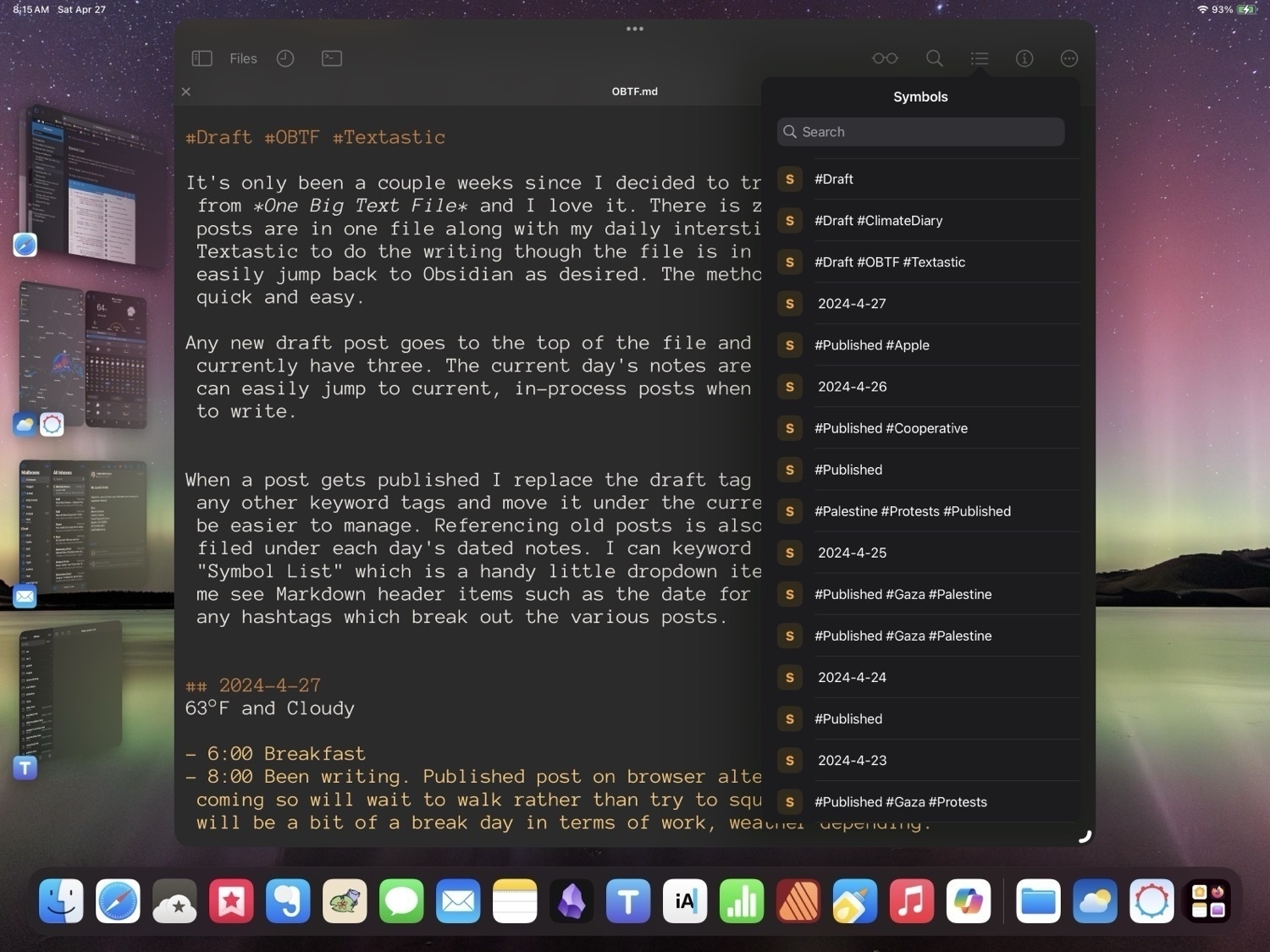
When a post gets published I replace the draft tag with published along with any other keyword tags and move it under the current day's notes. It could not be easier to manage. Referencing old posts is also easier as posts are neatly filed under the dated notes for each day. I can keyword search or use Textastic's "Symbol List" which is a handy little dropdown list in the toolbar that lets me see Markdown header items such as the date for each day's notes as well as any hashtags which break out the various posts. I can scroll down with a flick to quickly navigate the document. It almost seems too easy.
And the file is only 78 KB. Basic txt files for the win!
A brief exploration of alternative browsers on iPad
Is text editing on the iPad a problem?
Posting on Mastodon Scott Jenson suggested that text editing on the iPad is “tedious”. My initial reaction was, no, it’s not. I read through the thread and I think it speaks more to his lack of experience with the iPad. From his various posts it would seem he decided to jump into one of those “can the iPad be my computer stunts” and bumped into a variety of bugs and differences he didn’t like. Now, I can’t speak to the bugs as I’ve found the iPad with keyboard/trackpad to be rock solid for years.
I hopped over to his very in depth blog post. He makes some great points there in regards to touch-based editing of text but it seems to be oriented towards phone-based editing.
I’ve been coding and writing with a variety hardware keyboards and text editors on the iPad for years, have I just adapted to a poor experience? Is text editing that much better an a Mac? I don’t think so but I’ll get back to that comparison in a bit.
A few spring 2024 iPad thoughts
This is a crazy good deal if you want or need an alternative to Adobe apps. One time purchase, 30% off.
Affinity – Professional Creative Software
Affinity V2 Universal License
Get Version 2 of Affinity Designer, Affinity Photo and Affinity Publisher on all operating systems, including iPad, for one low bundle price.
All apps. All platforms.No subscription.
Was
USD$164.99Now $114.99