Pages and Affinity Publisher on the iPad Compared Part 1
I've been using Pages since the first version available on the Mac many years ago. And of course I used the first version that was available on the iPad from day one. In the years since the app has gone through many changes as Apple worked to bring compatibility between the iWork apps on the two platforms which began with the Pages 1.7 on iOS and on the Mac, version 4.3 in 2012. But the big change in 2013 with an overhauled Pages 5.0 on the Mac. This new version on the Mac was a step back in features and templates as it was brought inline with the upgraded iOS version of Pages.
Controversy!
Gradually features were added back in as Pages across the platforms were improved year to year. It's been 10 years since that major re-write and while the Mac version of Pages of 2023 is still different from the version of 2013 it is far more capable and the app across platforms is much closer to feature-for-feature parity.
Pages on the iPad
Pages is an excellent app for general purpose word processing and document layout. For students, businesses, organizations, Pages is a feature rich, capable app that's fairly easy to learn and use. Brochures, posters, flyers, newsletters, annual reports, research papers are all easily created with Pages. The app can export to Word, PDF, ePub as well as several other formats.
Over the years I've relied on Pages for a lot of my work with clients that required a pdf or Word document as the final product. Until Serif released Affinity Publisher in the fall of 2022 Pages was usually the app I used
Keeping in mind that Pages is free and intended for a general audience, ie, anyone that purchases an Apple device, I'd like to do a basic comparison to Affinity Publisher on the iPad. This is from the perspective of a more advanced Pages user but with an awareness that the app is not just for advanced users.
Pages - The misses
While I generally find the user interface and features of Pages to be a good balance for a large range of users, there are a few aspects of the design that I think could be improved. In addition, there are also a few features that still could be added to bring it closer to full parity with the Mac.
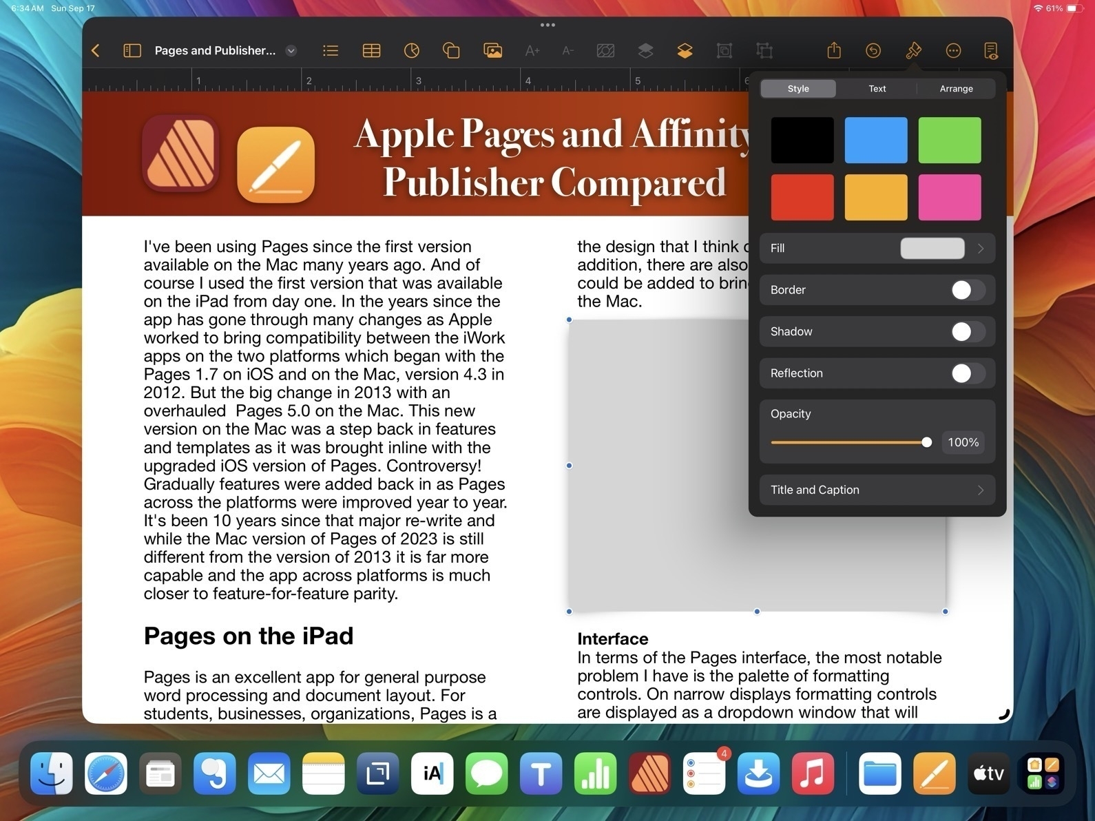
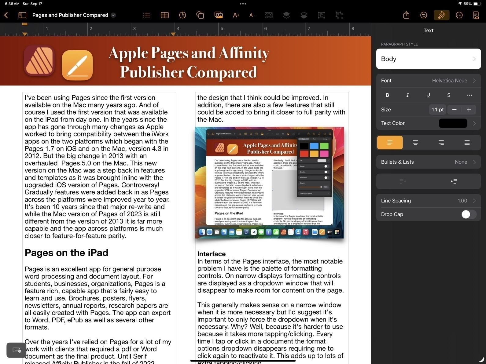
Interface In terms of the Pages interface, the most notable problem I have is the palette of formatting controls. On narrow displays formatting controls are displayed as a dropdown window that will disappear to make room for content on the page.
This generally makes sense on a narrow window when it is more necessary but I'd suggest it's important to only force the dropdown when it's necessary. Why? Well, because it's harder to use because it takes more tapping/clicking. Every time I tap or click in a document the format options dropdown disappears requiring me to click again to reactivate it. This adds up to lots of extra tapping/clicking.
Pages and Affinity Publisher Sidebars Compared
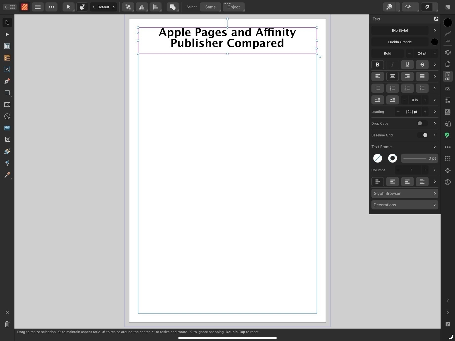
On the large 13" iPad there are many times I'd prefer to have a more permanent sidebar for the formatting options. The sidebar is available when the app is full screen or nearly full screen. I'd like to have a preference or the ability to pin the formatting options as a more permanent sidebar.
And on an external display, well, it actually feels broken. If I'm using an external 27" display I only get the sidebar when I'm in full screen mode. If I have a Pages window set as a floating window that takes up any other portion of screen, even if stretched across 24", I'm forced to use the dropdown formatting window. That's huge waste of space on a big screen.
Missing Tools
First, I'll note at least one tool that's missing on the iPad version of Pages which is present on the Mac: the pen tool for drawing complex, multi-point lines and shapes.
Now, comparing to Affinity, we begin to see how Publisher is an advanced application for a more specific, professional publishing and design audience. The reason for the smaller, more dense tool palette in Affinity Apps is because there are far more tools and options. Just as one example, text spacing. While Pages has many of the most important basic options such as finely adjustable line spacing and spacing before and after paragraphs, Affinity Publisher has all the very fine-grained controls expected of full publishing apps. While Pages has had many new features added over the years it still lacks options when compared to an app like Publisher. Really, there are far too many to list here. But I will note a small sample:
- Documents in Pages lack the option for "master pages". It is possible to have a page template which can have elements added that will appear across the document but it's far more limited.
- While Pages has built in snapping for objects on a page it lacks the option to add other guides to pages. Affinity Publisher allows for adding unlimited guides for flexible design of columns or other elements that will be snapped to as a document is put together. A less flexible but helpful work around in Pages is to use the more basic page template to set-up various invisible lines/boxes that can be used similarly.
- Document set-up in Pages also lacks options such as bleed and then, when exporting, options such as printers marks crop marks.
- Effects are far more limited in Pages. In fact, there are only two, reflection and shadow and they can only be applied at the block level. So, for example, a block of text as opposed to smaller level of elements like a single letter or word.
- Layers of objects in a Pages document can become cumbersome with larger documents. Affinity provides per page layering that is easier to manage with large documents.
That's just a small sample of what features found in Publisher but lacking in Pages. And they are significant. And yet, Pages is still quite capable. Let's move on to the features Pages does have that make it worth considering.
Pages - The hits
So, what does Pages on the iPad have going for it?
- Pages is free!
- While simplicity limits the potential results to some degree, it is easier to learn for new users.
- When learning Pages users are also becoming familiar with similar tools and interface elements found in the other iWork apps, Numbers and Keynote
- Pages works well with other iWork apps and Apple apps generally. Need to add a photo? You can drag a photo from the Files app or add it from the toolbar.
- Pages comes with a variety of ready-to-use, well designed templates for newer users.
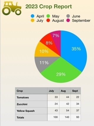
- Tables are much easier to set up and modify in Pages. Need a table with calculations? Just copy and paste in a table from Numbers. Charts are also easy to set-up in Pages.
- Interesting multimedia options for documents that won't be printed.
- Editable options for sharing to other users via built in collaboration tools for other Apple device users, Pages in iCloud or export to Word.
- Though this document is being created using the Page Layout option which is more freeform offering a blank canvas, there is also an option to start with a basic word processing document which makes getting started easier for that kind of document.
Conclusion
For people that are in a general use setting, Pages as a part of the larger iWork suite of apps makes a lot of sense. It's easier to get started for more novice users who might just need basic word processing or someone that needs to put together their first newsletter for a community group they belong to. It's easy to work with using touch, Pencil, trackpad or mouse or some combination of those. As a simpler app the settings are more sparse than dedicated professional graphics design apps like Publisher and yet provide enough to allow users to accomplish a great deal without getting bogged down.
For more advanced users Pages is powerful enough that large and fairly complicated documents are possible. Documents can be laid out using free form, linked text boxes intermingled with charts, tables of static data or live calculated data. Adding photos, line art, shapes or even embedded video or scrollable photo galleries are all options for export to multi-media ePubs. I've only touched on a small sample of the features found in Pages and just a simple example of what's possible in terms of designing documents with Pages.
Because it's a free app there's no cost to try it out and if you need to create documents it's an excellent app to start with.