The visual design and experience of using GNU/Linux
2025-12-28
Last week the folks that build the Elementary distribution of GNU/Linux announced the release of 8.1. I don’t usually jump to look at all the new releases of various distributions because I’ve been happy with Mint on my laptop and Trisquel on my Mini but I’ve been wanting to at least look at Elementary because I remembered hearing that it had a macOS inspired design. I looked and it does indeed have a macOS vibe going on. I was curious enough to download the ISO and flash it to a usb drive to test it.
Yes, it reminds me of macOS of a few years ago, none of the 26 Liquid Glass theme released by Apple a couple months ago. I’ve generally enjoyed the aesthetic design of Apple’s various operating systems for its Macs and iDevices. From the Platinum theme of the 1990s Systems 8 and 9 to OS X Aqua and then the numerous revisions of OS X into macOS, it was an interesting journey with many twists and turns. Read more about Apple’s Appearance Manager.
Platinum was subdued in comparison to the vibrant Aqua of OS X which was slowly flattened and subdued in the years following. The pin stripes and blue jelly-like pills were minimized as were the many drop shadows. Then Apple experimented for a few years with “brushed-metal” which was transformed into a dark gray gradient. The red, yellow and green “stop-light” buttons on every window went from glassy 3D bulbs to flat colored circles. As macOS evolved Apple was also experimenting for several years with skeuomorphic designs used heavily in iOS. These were removed completely with a flattened and simplified design revamp with iOS 7. Over the years there was great praise and great criticism of Apple’s choices. From too skeuomorphic to flat and plain, back and forth. Lot’s going on this year with the changes of Apple’s OS visual designs, more about that later. With the exception of third party utilities like Kaleidoscope theming in the 90s followed by Apple’s short experiment with native theming, the general rule is users accept what Apple dictates with each OS release. You don’t have to like it but you do have to use it.
GNU/Linux Mint with Cinnamon Desktop
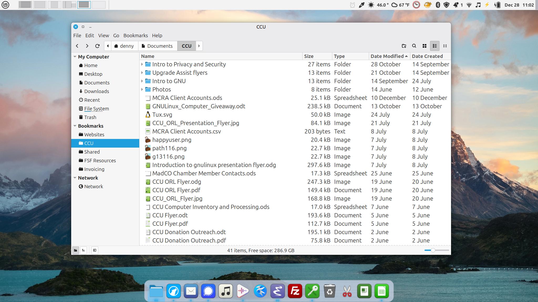
The Nemo file manager of Cinnamon Mint. The Plank app provides a Mac-like application dock along the bottom. The top panel is configured with an applet on the left side that provides a switcher for my desktops that includes an outline of windows in each desktop. The right side of the top panel hosts a series of applets including the a timer, color picker, weather, current time/date and several others.
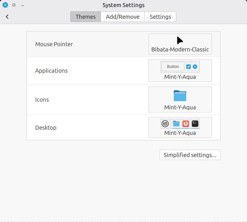
Cinnamon theme settings
By comparison, GNU/Linux is far more open in regards to the configurability of the OS desktop environment. Different distributions offer different desktop environments to choose from. Once installed a desktop environment can be modified in all sorts of ways. I’m using Mint’s Cinnamon desktop environment which offers theming options for the mouse pointer, application windows, icons and the desktop. It comes with quite a few default theme options as well as user created themes that can be downloaded from within the settings app. As a late 90s Mac user it immediately reminded me of Kaleidoscope. KDE Plasma which is the desktop environment I’ve got on the Trisquel Mini also has a variety of theming options including community created themes.
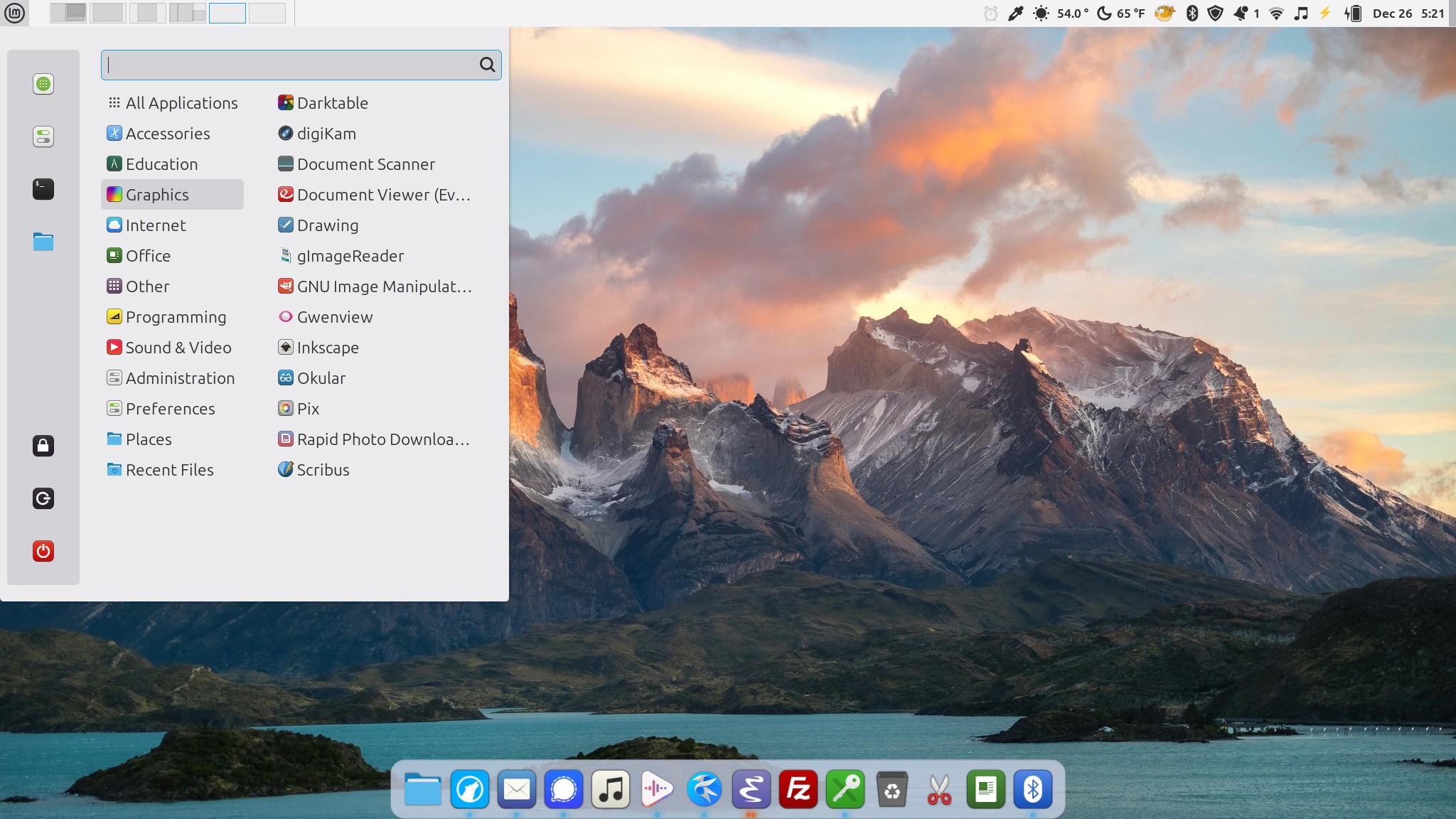
App Menu of Cinnamon Mint which shows various categories of apps, a quick search, favorites and system actions such as lock screen, logout and powerdown. This can be further customized but I mostly just use to launch apps or restart the laptop.
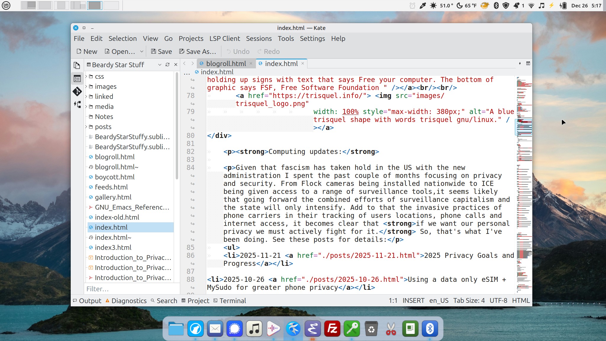
Kate code and text editor
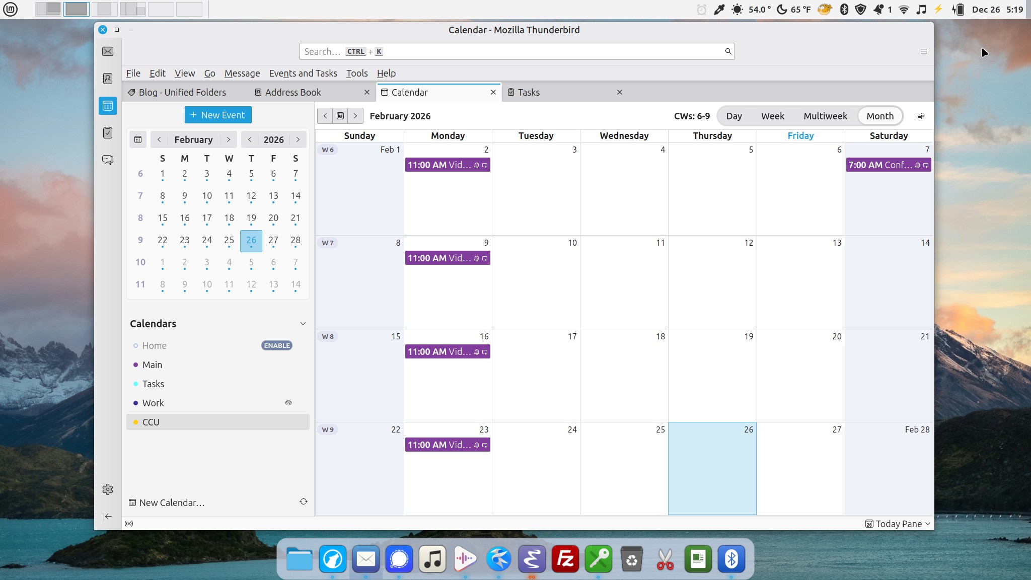
Thunderbird Calendar
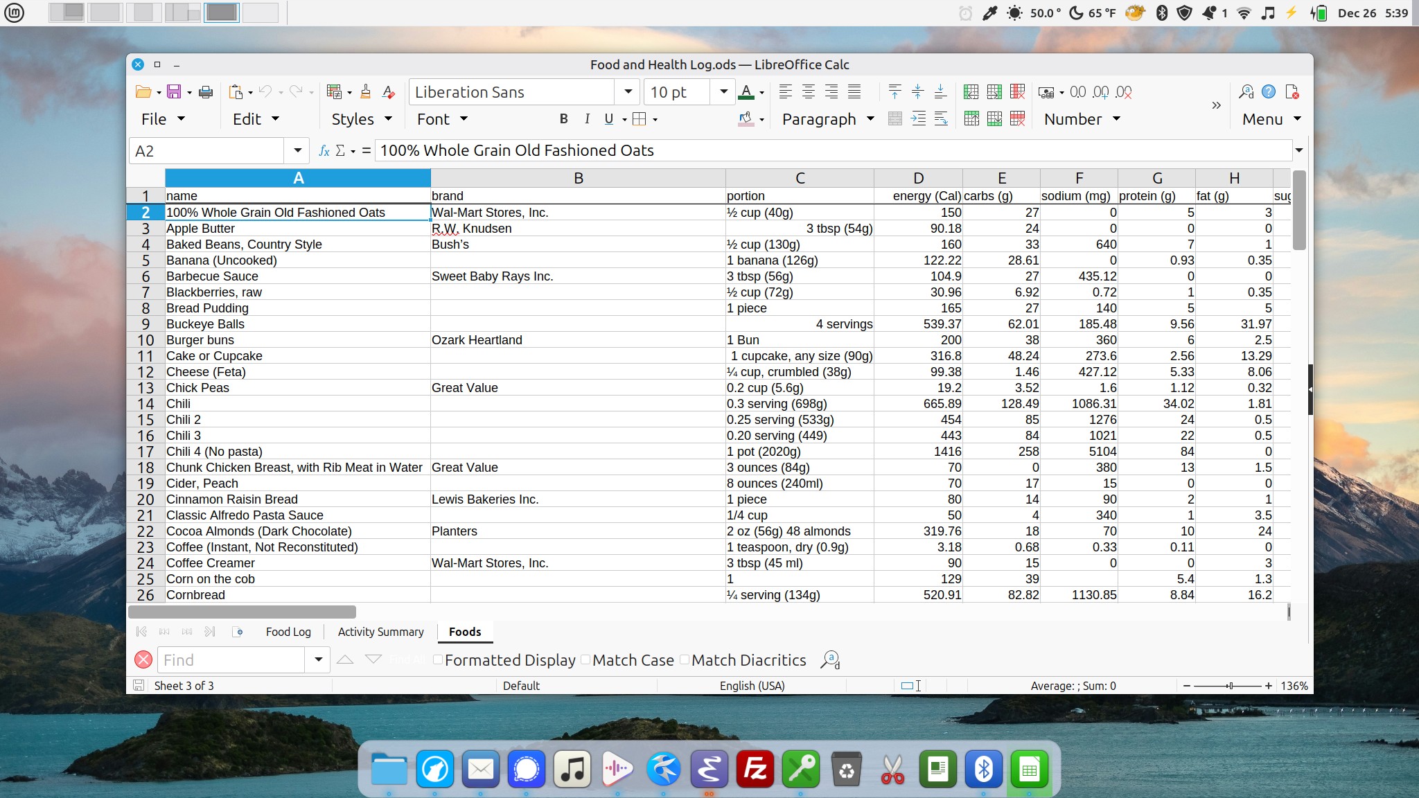
LibreCalc
When I first installed Mint with the Cinnamon desktop I was happy to stick with the default theme though I forget which one that was. It might be the one I’m using at the moment though I’ve switched a few times. It reminded me of the 90s era Platinum theme of the Mac. Pleasant, subdued but not too plain. I used it for a week or so with the default panel positioned along the bottom then began tweaking a bit. I moved the panel to the top and added the Workspace switcher applet to provide a visual display/switcher of my workspaces. Then I arranged various Applets along the right side. I basically set it up in a way that worked with my Mac muscle memory. Then I added a second panel back to the bottom of the screen to display app shortcuts in the center of the panel. Again, reminicent of the macOS dock. After looking at Elementary the other day I went looking and sure enough, there’s an app called Plank that provides a macOS like center dock which I installed and am using for the moment.
I've also added a few images of frequently used apps. This is another area where GNU/Linux is often critiqued. Specifically, I've read many times that the available apps are either difficult to use, ugly, or both. This is just hogwash. The apps I'm using on a regular basis are as easy to use as any other desktop app in comparable categories on the Mac or Windows. Are they identical? Of course not. Different apps, different OS, so, they're likely different. But they are fully featured and work very well. And, to my eyes, they fit well within the OS in terms the applied window theme.

A weather widget and the Dolphin files management app in the KDE Plasma desktop environment. This computer is used inside and stays in dark mode.
I’ve opted for very different theme on the KDE Plasma desktop environment on the Trisquel Mini. I’ve got a similar top panel and no panel at all along the bottom. And I’m using a dark theme, Psion, that has a fairly different feel. Though many of the themes for KDE Plasma are not what I would choose, the point is that there are many to choose from. A user can stick with the default that works fairly well or they can go exploring. I’m glad I found Psion and I’ve been using it for months.
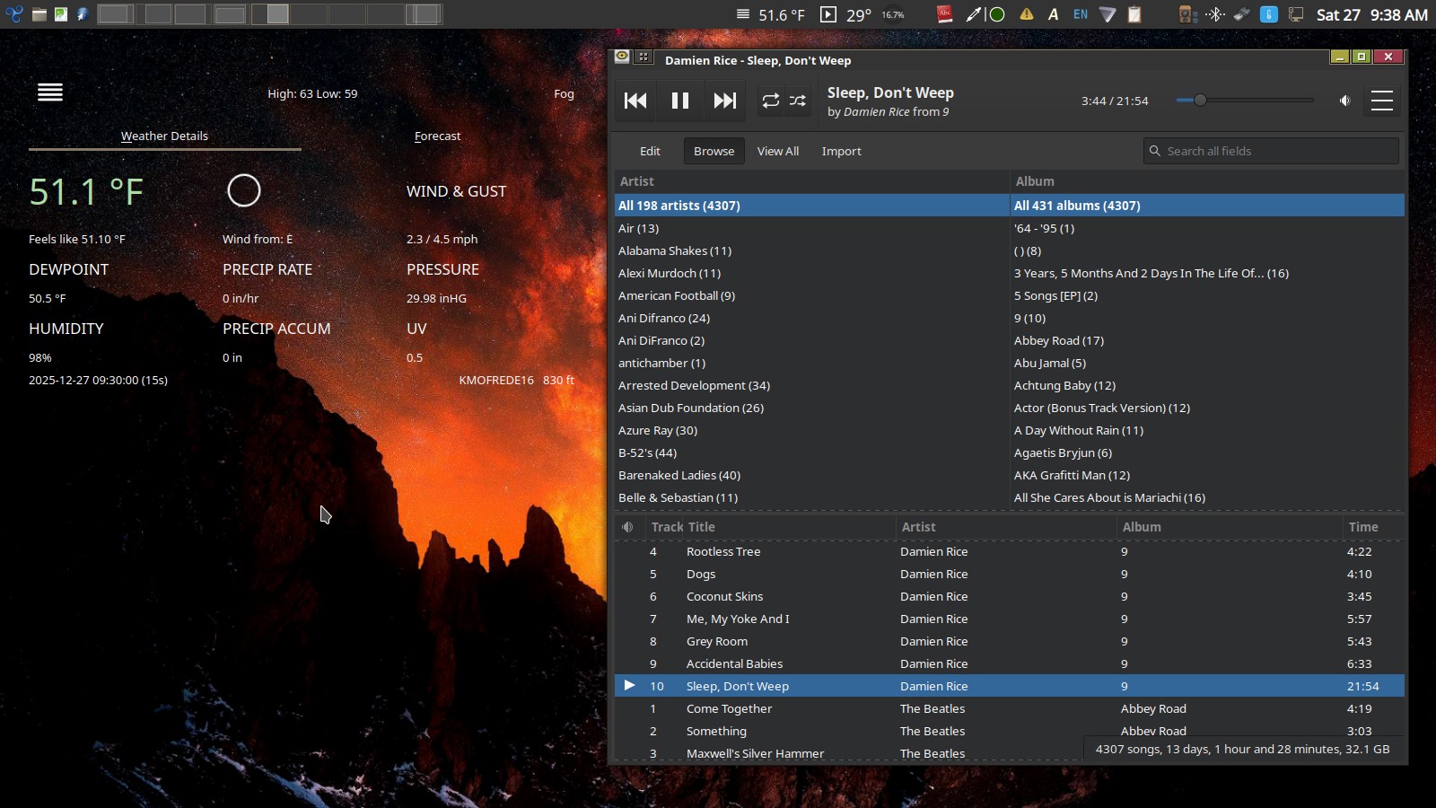
The Rhythmbox application is my go-to Music application on both GNU/Linux computers.
One of the reasons I’ve enjoyed using GNU/Linux this first year is the quality of the visual design of the user interface as well as the fact that I have a choice to change that design. I had a bias and expectation coming in that I would be settling for something of less quality than what I had assumed was an Apple advantage. Which brings me to the historical and biased belief amongst Apple enthusiasts that Apple’s interface design is unmatched and that the resulting user experience is unrivaled. This is particularly interesting in light of recent years’ steady stream of complaints regarding the quality of Apple’s various operating systems. From bugs to visual design, it’s too long to list here. Anyone following the release of this fall’s release of the various Apple operating systems will have seen the tidal wave of complaints regarding the newly introduced Liquid Glass theme.
A lot of shade has been thrown at GNU/Linux over the years regarding ease of use and poor visual design and I’ve gathered that some of those criticisms were warranted in the past. I’m not sure at what point things began to shift, I can only say that my 10 months of use were the opposite of what I expected based on reputation. If you're someone interested in migrating away from Windows or macOS I'd encourage you to check it out. Downloading an ISO from the Linux Mint website costs nothing. Flash it to a thumb drive using their instructions and boot from that thumbdrive to take it for a test drive. Mint won't work on the latest M series Macs but older Macs should be no problem. If you're using an M series Mac check out Elementary which does support some of the newer Apple Silicon hardware. Whether you're using Windows or Mac, look-up the start-up shortcuts that will get you to a boot options menu for your particular OS or computer.
I don't have comments but I love email or you can find me on Mastodon.
Share this post 