2024-09-29
Weaving the web but more like frogs visiting in a pond

As I browsed some open tabs this morning I read through Mandy Brown's note What are we making together? | A Working Library. She discusses a retreat from social media timelines and the structure and patterns of those timelines.
Which makes me want to spend time with a few different questions: what would it mean to build design patterns that respond to, or counter, or engage with those impulses, in some way? I’m not interested in paternalistic nudges or vapid prompts to think twice, but rather, something like the way a well-designed park creates space both to gather and to wander—quiet benches tucked under trees alongside open fields fit for games, pathways for walking in ones and twos, blooms and birdhouses that invite a moment of rest. What if our social spaces had more ways to get lost? More places to sit a spell? What if we brought more intention to the way we contribute to these patterns? To the way our own choices overflow the container, and push on what’s possible.
It reminds me of a post I made exactly one year ago to the day, what are the chances? I'd woken up in the middle of the nightand started writing and was having difficulty in my usual text editor so on a whim I opened Apple's Freeform app and tried something different. In that moment I wanted something spatial. My mind was in that sometimes-early-morning state of ideas frenetically bouncing around and I was just trying to get them on the screen non-linearally. I ended up following one of the ideas which led to the odd experience of writing a blog post in Freeform about Freeform as a potential temporary spatial social network. Apple's Freeform as Social Media Collaboration Space
The bit that I'll mention here because I think it fits with Mandy's post and it's been on my mind quite a bit lately:
What about a non-linear, non-feed space?
The monolithic, linear timeline with a steady flow of traffic has been the primary embodiment of social media thus far. And much if not most of the internet as we know it has followed this trend. It reminds me of the classic video game Frogger. I enjoyed that game as a kid and yet it made me anxious. Trying to hop across roads congested by constant traffic and across logs moving in opposite directions. We’re in one flow of traffic and then hop to the next to the next and then the next. Is it any wonder that we often use the term “doom” scrolling when we describe social media? Even without the bad news of the day, it’s a constant, never ending flow, a road of never ending traffic.
But what about a non-directional space? Rather than a constant flow of news, might we create slower spaces that feel more like parks or digital maker spaces?
Our experience of computers might be described as screen or window jumping that allows for a mix of scrolling and clicking. It's a combination that seems to lend itself to an easily distracted, fragmented experience. Even the early web that many of us have been remembering and talking fondly of was, in many ways, a similar stream or feed. From Live Journal to RSS to blogs, the feed never ends because the feed is meant to be concurrent with time with the added benefit of scroll back. Back and forth we go with the flick of a finger. And with a tap or a click our screen is suddenly different. A new page or a new app with new content. The default experience is disjointed.
We experience life as a blend of space and time. We move through both simultaneously. And while time progresses in one direction, our spatial experience is free form. Any direction is possible.
Real life is spatial. The best parts of life are often experienced in cozy rooms or parks. The most anxious parts of life are associated with non-stop traffic down busy roads.
So I asked myself, how might we begin to create digital space that is slower, more collaborative and less focused on constant consumption and production of a steady stream? What would it look like? Is that kind of space possible? Would anyone be interested?
This post along with my previous is just a personal meander of questions and ideas centered on the computing experience and particularly the web experience. The web, by its very name, calls into the imagination a multi-directional movement. But we're also looking for an overview and anchor points for grounding. We often want to hold onto context, hence browsers filled with tabs we have not finished with and are collecting. Recently popular apps like Obsidian that provide visual maps to link between ideas, people, documents, an example of a kind of search for meaning and context in a folder of your collected documents, a personal web.
I'll close the post by returning to Mandy's questions again:
What if our social spaces had more ways to get lost? More places to sit a spell? What if we brought more intention to the way we contribute to these patterns? To the way our own choices overflow the container, and push on what’s possible.
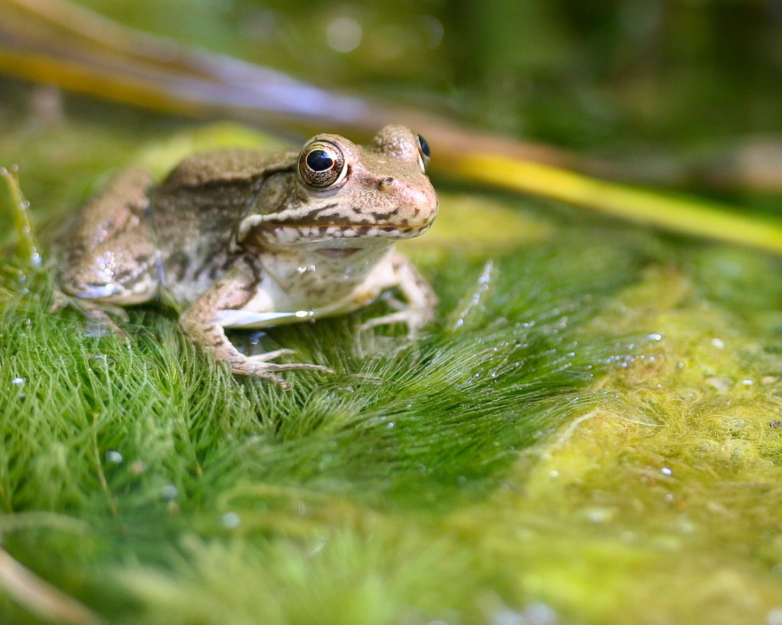
I think this is what some of us are looking for when we talk about weaving a social web experience with personal sites and blogs that link freely and often. Not so much spiders in search of a meal, but, rather, frogs in a pond visiting one another's lilli pads to share a croak.
I don't have comments but I love email or you can find me on Mastodon.