2023–08–16
Multitasking and Windowing on the iPad Pro
In recent days I’ve been thinking more about multitasking and windowing on larger iPads. I posted a couple days ago about using the iPad Mini more often in part because I’d been feeling that I might be better served by the smaller iPad Mini for non-work, everyday sort of browsing and reading.

Stage Manager on the iPad Pro
Is Mac windowing the ideal?
As luck would have it the same day I posted that story the weekly episode of Mac Power Users was released and the topic covered: window management on the Mac. In recent weeks and months I’ve been seeing the topic of window management on the Mac come up on Mastodon and podcasts. When I’ve seen it come up it’s being posed as “why is window management on the Mac still a mess and when/how will Apple fix it?”
I can’t help but puzzle at this because for the past couple of years much of the ongoing critique/frustration directed towards the iPad from the nerd community has been along the lines of “iPad multi-tasking is terrible, the iPad needs windowing like the Mac, the iPad needs macOS, etc.” Then Stage Manager came last year and that critique got louder with the Mac being held up as the windowing that the iPad needs.
So this iPad user has been surprised to hear recently that at least some users think windowing on the Mac is too complex and needs to be fixed. 🤨🤪🧐
In the MPU episode one of the solutions mentioned repeatedly is tiled windows which is an option in Windows OS. On the Mac there is no Apple provided solution for tiling beyond 2 split windows but there are several 3rd party solutions and these seem to be fairly popular for those that don’t want to spend a lot of time with arranging free form windows.
Multitasking and windowing on the iPad

Split View on the iPad Pro
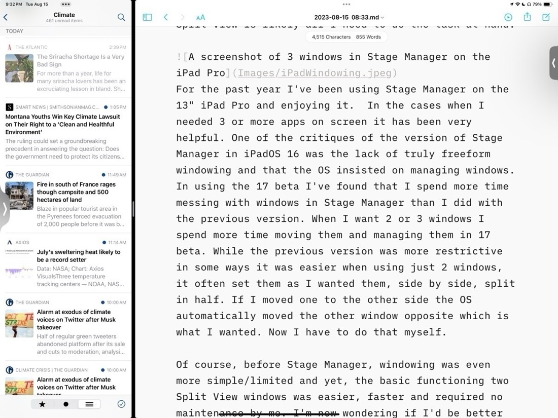
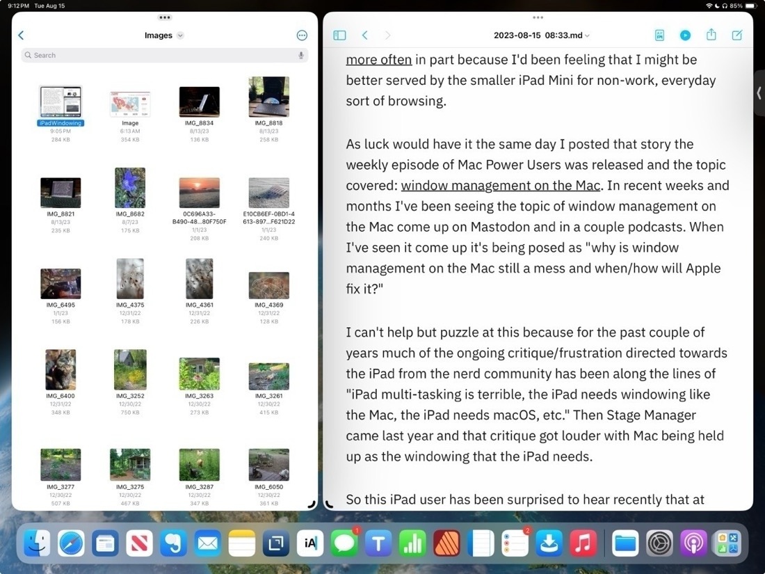
When using the 13" iPad, more often than not, I only actually use one app at a time. And on the occasions that I need more than one app it’s often just 2 apps that I need and the relatively simple Split View is likely all I need to do the task at hand. Before the introduction of Stage Manager with iPadOS 16 Split View served me very well. Though it is a more limited option the basic functioning of two Split View windows is also easier, faster and requires practically no maintenance by me. It provides a hint at why some Mac users want window tiling as an option.
I can understand why some users would want more than two app windows and that’s why Apple tried to solve the problem first with Slide Over windows and then the floating windows found in picture-in-picture video and then Quick Notes. Though helpful all three of those options have their various limitations in terms of sizing and placement on screen. And of course in each case they cover up a portion of the screen. Some (myself included) wished for an option to have three tiled windows rather than just 2 Split View. I’ll come back to that.
Stage Manager
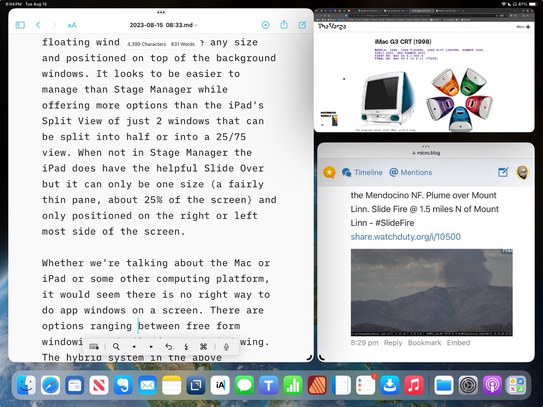
With the first version of Stage Manager users got something close to tiling. A kind windowing with floating windows with more sizing options than previously but still managed in placement. Almost tiling but not quite. Almost free form Mac windowing but not quite. And for the past year at least some iPad users complained quite loudly that it still didn’t solve their problems.

Stage Manager on the iPad Pro
For the past year I’ve been using Stage Manager on the 13" iPad Pro and enjoying it. In the cases when I needed 3 or more apps on screen it has been very helpful. But it’s worth pointing out that even the 13" iPad is on the small size when compared to laptops in part because window chrome takes up more space. On the 11" this is even more true. With the added window chrome and border space around windows forced by the OS, really makes using 3 windows or more feel cramped. It works on the 13" screen but I can’t imagine using that many windows on an 11" iPad.
In using Stage Manager on iPadOS 17 beta I’ve found that I spend more time managing windows than I did with the previous version. While it’s true that I have much more control of positioning and sizing that increased control also translates into more time and effort from me. But this is exactly what many users clamored for. A more Mac-like, free form windowing.
But there absolutely is a trade off. While the previous version was more restrictive in some cases, for example if I just want two evenly split windows, it was much easier. I could set them up and if I wanted to switch sides I could just drag one and the OS would move the other for me. Now I have to move one window then move the other. It’s a small thing but it can add up over a day as you find yourself adjusting tasks and workflows.
Between the two versions of Stage Manager I’m not sure which I prefer or if I actually would be better served going back to that simpler multitasking version Split View with Slide Over as needed. On the smaller screen of the iPad, with more window chrome, I’m starting to think that there is a third, better option.
Tiling
Personally I was hoping for some version of tiled windows. Watching this video review of the Samsung Galaxy Tab S9 Plus and at about 3:46 I see something very close to what I would consider ideal. Essentially, it’s an improved version of Split View that allows for up to 3 windows that can be split into any size. It also allows for windows to be pulled into “pop-up view” which is, essentially, a free form floating window that can be any size and positioned on top of the background windows. It looks to be easier to manage than Stage Manager while offering more options than the iPad’s Split View of just 2 windows that can be split into 50/50 or into a 25/75 view. I think a 3 pane Split View would be far more useful than the current model that allows for the addition of a Slide Over window that covers other content.
Whether we’re talking about the Mac or iPad or some other computing platform, there is no perfect way to do app windows on a screen. There are options ranging between free form windowing and tiled/managed windowing. On the iPad I do think Stage Manager as optional mode is definitely an improvement and I suspect that many that wanted windowing on the iPad will be happy with the new freer form implementation.
For myself, I’ll be wishing for tiled windows in the above mentioned Galaxy Tab review. An option for a third pane Split View with free-form splits of any size would be my ideal.